Customizable controls
One of the things that we wanted to support from day one is customizable controls on resource pages.
WARNING
At the moment, only the Show view has customizable controls.
Default buttons
By default, Avo displays a few buttons for the user to use on the Index, Show, and Edit views which you can override using the appropriate resource options.
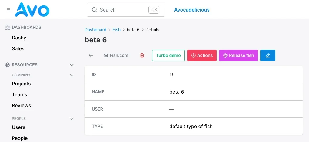
Show page
On the Show view the default configuration is back_button, delete_button, detach_button, actions_list, and edit_button. You can override them using show_controls.
Customize the controls
To start customizing the buttons, add a show_controls block and start adding the desired controls.
class FishResource < Avo::BaseResource
  self.show_controls = -> do
    back_button label: "", title: "Go back now"
    link_to "Fish.com", "https://fish.com", icon: "heroicons/outline/academic-cap", target: :_blank
    link_to "Turbo demo", "/admin/resources/fish/#{params[:id]}?change_to=🚀🚀🚀 New content here 🚀🚀🚀",
      class: ".custom-class",
      data: {
        turbo_frame: "fish_custom_action_demo"
      }
    delete_button label: "", title: "something"
    detach_button label: "", title: "something"
    actions_list exclude: [ReleaseFish], style: :primary, color: :slate
    action ReleaseFish, style: :primary, color: :fuchsia, icon: "heroicons/outline/globe"
    edit_button label: ""
  end
end
Controls
A control is an item that you can place in a designated area. They can be one of the default ones like back_button, delete_button, or edit_button to custom ones like link_to or action.
You may use the following controls:
-> back_button
Supported options
label, title, style, color, and icon.
-> delete_button
Supported options
label, title, style, color, and icon.
-> detach_button
Supported options
label, title, style, color, and icon.
-> actions_list
Supported options
label, title, style, color, icon, and exclude.
exclude option
Filters out the specified actions.
It's used in conjunction with the action control. For example, when you extract an action, you don't want it to be displayed in the actions_list anymore, so you use the exclude option to filter it out.
Example
actions_list exclude: DisableAccount
# Or
actions_list exclude: [ExportSelection, PublishPost]
-> edit_button
Supported options
label, title, style, color, and icon.
-> link_to
Supported options
title, style, color, icon, target, data, and class.
-> action
Supported options
title, style, color, and icon.
Example
action DisableAccount
action ExportSelection, style: :text
action PublishPost, color: :fuchsia, icon: "heroicons/outline/eye"
WARNING
The way show_controls works is like a shortcut the the actions that you already declared on your resource, so you should also declare it on the resource as you normally would in order to have it here.
class FishResource < Avo::BaseResource
  self.title = :name

  self.show_controls = -> do
    # In order to use it here
    action ReleaseFish, style: :primary, color: :fuchsia
  end

  # Also declare it here
  action ReleaseFish, arguments: { both_actions: "Will use them" }
end
```
Control Options
-> title
Possible values
Any string value.
-> style
Possible values
:primary, :outline, :text
-> color
Possible values
Can be any color of Tailwind's default color pallete as a symbol.
-> icon
Possible values
Any Heroicon you want. You must specify the style of the heroicon like so heoricons/outline/academic-cap or heroicons/solid/adjustments.
-> target
Possible values
:_blank, :_top, :_self
-> class
Possible values
Any string value.
Conditionally hiding/showing actions
Actions have the visible block where you can control the visibility of an action. In the context of show_controls that block is not taken into account, but yiou can use regular if/else statements because the action declaration is wrapped in a block.
class FishResource < Avo::BaseResource
  self.show_controls = -> do
    back_button label: "", title: "Go back now"

    # visibility conditional
    if record.something?
      action ReleaseFish, style: :primary, color: :fuchsia, icon: "heroicons/outline/globe"
    end

    edit_button label: ""
  end
end