Avo::PanelComponent
The panel component is one of the most used components in Avo.
erb
<%= render Avo::PanelComponent.new(title: @product.name, description: @product.description) do |c| %>
  <% c.with_tools do %>
    <%= a_link(@product.link, icon: 'heroicons/solid/academic-cap', style: :primary, color: :primary) do %>
      View product
    <% end %>
  <% end %>

  <% c.with_body do %>
    <div class="flex flex-col p-4 min-h-24">
      <div class="space-y-4">
        <h3>Product information</h3>

        <p>Style: shiny</p>
      </div>
    </div>
  <% end %>
<% end %>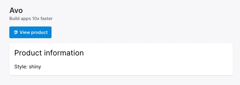
Options
All options are optional. You may render a panel without options.
erb
<%= render Avo::PanelComponent.new do |c| %>
  <% c.with_body do %>
    Something here.
  <% end %>
<% end %>
-> name
-> description
-> classes
-> body_classes
-> data
-> display_breadcrumbs
Slots
The component has a few slots where you customize the content in certain areas.
-> tools
We created this slot as a place to put resource controls like the back, edit, delete, and detach buttons. This slot will collapse under the title and description when the screen resolution falls under `1024px`.
The section is automatically aligned to the right using justify-end class.
erb
<%= render Avo::PanelComponent.new(name: "Dashboard") do |c| %>
  <% c.with_tools do %>
    <%= a_link('/admin', icon: 'heroicons/solid/academic-cap', style: :primary) do %>
      Admin
    <% end %>
  <% end %>
<% end %>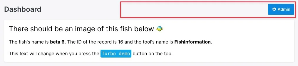
-> body
This is one of the main slots of the component where the bulk of the content is displayed.
erb
<%= render Avo::PanelComponent.new do |c| %>
  <% c.with_body do %>
    Something here.
  <% end %>
<% end %>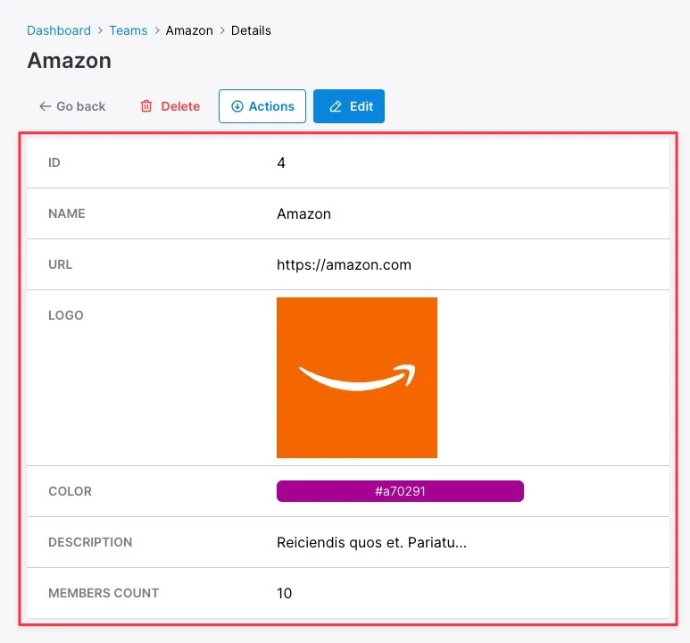
-> bare_content
Used when displaying the [Grid view](./../grid-view), it displays the data flush in the container and with no background.
erb
<%= render Avo::PanelComponent.new do |c| %>
  <% c.with_bare_content do %>
    Something here.
  <% end %>
<% end %>
-> footer_tools
This is pretty much the same slot as `tools` but rendered under the `body` or `bare_content` slots.
erb
<%= render Avo::PanelComponent.new do |c| %>
  <% c.with_footer_controls do %>
    Something here.
  <% end %>
<% end %>
-> footer
The lowest available area at the end of the component.
erb
<%= render Avo::PanelComponent.new do |c| %>
  <% c.with_footer do %>
    Something here.
  <% end %>
<% end %>
-> sidebar
The sidebar will conveniently show things in a smaller area on the right of the `body`.
erb
<%= render Avo::PanelComponent.new do |c| %>
  <% c.with_sidebar do %>
    Something tiny here.
  <% end %>
<% end %>
-> bare_sidebar
Use this instead of `sidebar` to display content in a sidebar without the white background styling.
erb
<%= render Avo::PanelComponent.new do |c| %>
  <% c.with_bare_sidebar do %>
    Something tiny here.
  <% end %>
<% end %>