Field wrappers
Each field display in your Avo resource has a field wrapper that helps display it in a cohesive way across the whole app. This not only helps with a unitary design, but also with styling in a future theming feature.
INFO
You'll probably never have to use these components and helpers by themselves, but we'd like to document how they work as a future reference for everyone.
Index field wrapper
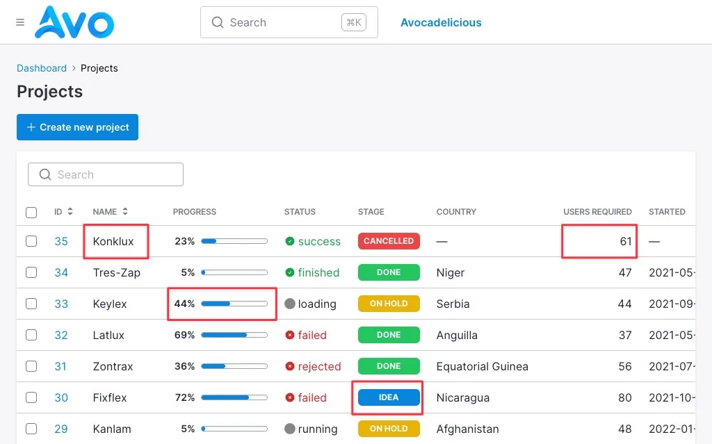
Each field displayed on the Index view is wrapped in this component that regulates the way content is displayed and makes it easy to control some options.
You may use the component Avo::Index::FieldWrapperComponent or the helper index_field_wrapper.
-> dash_if_blank
Default
true
<%= index_field_wrapper **field_wrapper_args, dash_if_blank: false do %>
  <%= render Avo::Fields::Common::BooleanCheckComponent.new checked: @field.value %>
<% end %>
-> center_content
Default
false
<%= index_field_wrapper **field_wrapper_args, center_content: true do %>
  <%= render Avo::Fields::Common::BooleanCheckComponent.new checked: @field.value %>
<% end %>
-> flush
Default
false
<%= index_field_wrapper **field_wrapper_args, flush: false do %>
  <%= render Avo::Fields::Common::BooleanCheckComponent.new checked: @field.value %>
<% end %>
-> field
<%= index_field_wrapper **field_wrapper_args do %>
  <%= render Avo::Fields::Common::BooleanCheckComponent.new checked: @field.value %>
<% end %>
-> resource
<%= index_field_wrapper **field_wrapper_args do %>
  <%= render Avo::Fields::Common::BooleanCheckComponent.new checked: @field.value %>
<% end %>
Show & Edit field wrapper
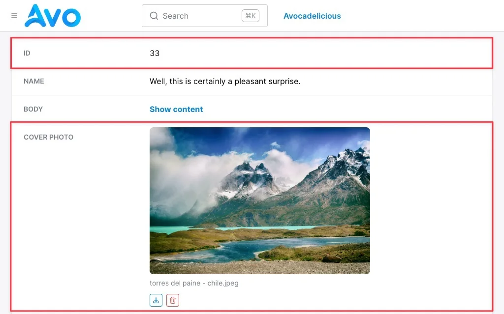
The Show and Edit field wrappers are actually the same component.
You may use the component Avo::Index::FieldWrapperComponent or the helper field_wrapper.
Field wrapper areas
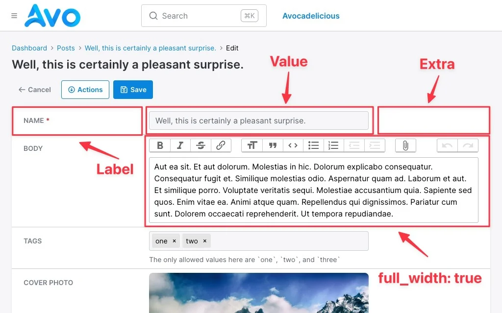
Each field wrapper is divided in three areas.
Label
This is where the field name is being displayed. This is also where the required asterisk is added for required fields.
Value
This area holds the actual value of the field or it's representation. The falue can be simple text or more advanced types like images, advanced pickers, and content editors.
At the bottom the help text is going to be shown on the Edit view and below it the validation error.
Extra
This space is rarely used and it's there just to fill some horizontal space so the content doesn't span to the whole width and maintain its readability. With the introduction of the sidebar, this space will be ignored
Options
-> dash_if_blank
Default
true
<%= field_wrapper **field_wrapper_args, dash_if_blank: false do %>
  <%= render Avo::Fields::Common::BooleanCheckComponent.new checked: @field.value %>
<% end %>
-> compact
This is enabled on the fields displayed in actions.
Default
false
<%= field_wrapper **field_wrapper_args, compact: true do %>
  <%= render Avo::Fields::Common::BooleanCheckComponent.new checked: @field.value %>
<% end %>
-> data
<%= field_wrapper **field_wrapper_args, data: {controller: "boolean-check"} do %>
  <%= render Avo::Fields::Common::BooleanCheckComponent.new checked: @field.value %>
<% end %>
-> full_width
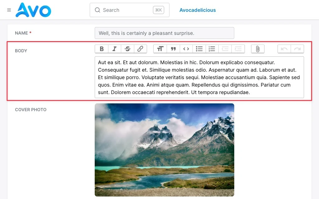
This is used on fields that require a larger area to be displayed like WYSIWYG editors, KeyValue, or file fields.
Default
false
<%= field_wrapper **field_wrapper_args, full_width: true do %>
  <%= render Avo::Fields::Common::BooleanCheckComponent.new checked: @field.value %>
<% end %>
-> form
Edit view. <%= field_wrapper **field_wrapper_args do %>
<%= render Avo::Fields::Common::BooleanCheckComponent.new checked: @field.value %>
<% end %>-> field
<%= field_wrapper **field_wrapper_args do %>
  <%= render Avo::Fields::Common::BooleanCheckComponent.new checked: @field.value %>
<% end %>
-> help
Edit view. <%= field_wrapper **field_wrapper_args, help: "Specify if the post is published or not." do %>
<%= render Avo::Fields::Common::BooleanCheckComponent.new checked: @field.value %>
<% end %>-> label
<%= field_wrapper **field_wrapper_args, label: "Post is published" do %>
<%= render Avo::Fields::Common::BooleanCheckComponent.new checked: @field.value %>
<% end %>-> resource
<%= field_wrapper **field_wrapper_args do %>
  <%= render Avo::Fields::Common::BooleanCheckComponent.new checked: @field.value %>
<% end %>
-> stacked
<%= field_wrapper **field_wrapper_args, style: "background: red" do %>
  <%= render Avo::Fields::Common::BooleanCheckComponent.new checked: @field.value %>
<% end %>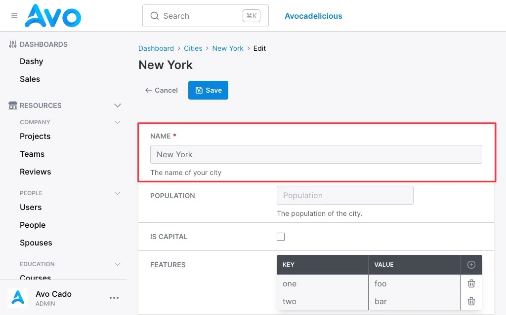
-> style
<%= field_wrapper **field_wrapper_args, style: "background: red" do %>
  <%= render Avo::Fields::Common::BooleanCheckComponent.new checked: @field.value %>
<% end %>