 Friendly.rb - Your friendly European Ruby Conference
 Dashboards
WARNING
You must manually require the chartkick gem in your Gemfile.
# Create beautiful JavaScript charts with one line of Ruby
gem "chartkick"
There comes the point in your app's life when you need to display the data in an aggregated form like a metric or chart. That's what Avo's Dashboards are all about.
Generate a dashboard
Run bin/rails g avo:dashboard my_dashboard to get a shiny new dashboard.
class Avo::Dashboards::MyDashboard < Avo::Dashboards::BaseDashboard
  self.id = 'my_dashboard'
  self.name = 'Dashy'
  self.description = 'The first dashbaord'
  self.grid_cols = 3

  def cards
    card Avo::Cards::ExampleMetric
    card Avo::Cards::ExampleAreaChart
    card Avo::Cards::ExampleScatterChart
    card Avo::Cards::PercentDone
    card Avo::Cards::AmountRaised
    card Avo::Cards::ExampleLineChart
    card Avo::Cards::ExampleColumnChart
    card Avo::Cards::ExamplePieChart
    card Avo::Cards::ExampleBarChart
    divider label: "Custom partials"
    card Avo::Cards::ExampleCustomPartial
    card Avo::Cards::MapCard
  end
end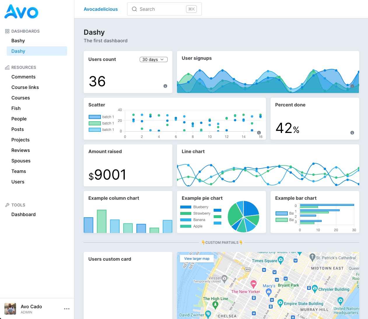
Settings
Each dashboard is a file. It holds information about itself like the id, name, description, and how many columns its grid has.
The id field has to be unique. The name is what the user sees in big letters on top of the page, and the description is some text you pass to give the user more details regarding the dashboard.
Using the ' grid_cols ' parameter, you may organize the cards in a grid with 3, 4, 5, or 6 columns using the grid_cols parameter. The default is 3.
Cards
Override card arguments from the dashboard
We found ourselves in the position to add a few cards that were the same card but with a slight difference. Ex: Have one Users count card and another Active users count card. They both count users, but the latter has an active: true condition applied.
Before, we'd have to duplicate that card and modify the query method slightly but end up with duplicated boilerplate code. For those scenarios, we created the arguments attribute. It allows you to send arbitrary arguments to the card from the parent.
class Avo::Dashboards::Dashy < Avo::Dashboards::BaseDashboard
  self.id = "dashy"
  self.name = "Dashy"

  def cards
    card Avo::Cards::UsersCount
    card Avo::Cards::UsersCount, arguments: {
      active_users: true
    }
  end
end
Now we can pick up that option in the card and update the query accordingly.
class Avo::Cards::UsersCount < Avo::Cards::MetricCard
  self.id = "users_metric"
  self.label = "Users count"

  # You have access to context, params, range, current parent, and current card
  def query
    scope = User

    if arguments[:active_users].present?
      scope = scope.active
    end

    result scope.count
  end
end
That gives you an extra layer of control without code duplication and the best developer experience.
Control the base settings from the parent
Evidently, you don't want to show the same label, description, and other details for that second card from the first card. Therefore, you can control the label, description, cols, rows, visible, and refresh_every arguments from the parent declaration.
class Avo::Dashboards::Dashy < Avo::Dashboards::BaseDashboard
  self.id = "dashy"
  self.name = "Dashy"

  def cards
    card Avo::Cards::UsersCount
    card Avo::Cards::UsersCount,
      label: "Active users",
      description: "Active users count",
      cols: 2,
      rows: 2,
      visible: -> { true }
      refresh_every: 2.minutes,
      arguments: {
        active_users: true
      }
  end
end
Dashboards visibility
You might want to hide specific dashboards from certain users. You can do that using the visible option. The option can be a boolean true/false or a block where you have access to the params, current_user, context, and dashboard.
If you don't pass anything to visible, the dashboard will be available for anyone.
class Avo::Dashboards::ComplexDash < Avo::Dashboards::BaseDashboard
  self.id = "complex_dash"
  self.name = "Complex dash"
  self.description = "Complex dash description"
  self.visible = -> do
    current_user.is_admin?
    # or
    params[:something] == 'something else'
    # or
    context[:your_param] == params[:something_else]
  end

  def cards
    card Avo::Cards::UsersCount
  end
end
Dashboards authorization
Since v2.22You can set authorization rules for dashboards using the authorize block.
class Avo::Dashboards::Dashy < Avo::Dashboards::BaseDashboard
  self.id = 'dashy'
  self.authorize = -> do
    # You have access to current_user, params, request, context, adn view_context.
    current_user.is_admin?
  end
end