Cards
Cards are one way of quickly adding custom content for your users.
Cards can be used on dashboards or resources, we'll refer to both of them as "parent" since they're hosting the cards.
You can add three types of cards to your parent: partial, metric, and chartkick.
Base settings
All cards have some standard settings like id, which must be unique, label and description. The label will be the title of your card, and description will show a tiny question mark icon on the bottom right with a tooltip with that description.
Each card has its own cols and rows settings to control the width and height of the card inside the parent's grid. They can have values from 1 to 6.
All this settings can be called as an lambda.
The lambda will be executed using Avo::ExecutionContext. Within this blocks, you gain access to all attributes of Avo::ExecutionContext along with the parent, resource, dashboard and card.
class Avo::Cards::UsersMetric < Avo::Cards::MetricCard
  self.id = "users_metric"
  self.label = -> { "Users count" }
  self.description = -> { "Users description" }
  self.cols = 1
  self.rows = 1
  self.display_header = true
end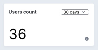
Ranges
Control the aggregation using ranges
You may also want to give the user the ability to query data in different ranges. You can control what's passed in the dropdown using the' ranges' attribute. The array passed here will be parsed and displayed on the card. All integers are transformed to days, and other string variables will be passed as they are.
You can also set a default range using the initial_range attribute.
The ranges have been changed a bit since version 2.8. The parameter you pass to the range option will be directly passed to the options_for_select helper, so it behaves more like a regular select_tag.
class Avo::Cards::UsersMetric < Avo::Cards::MetricCard
  self.id = 'users_metric'
  self.label = 'Users count'
  self.initial_range = 30
  self.ranges = {
    "7 days": 7,
    "30 days": 30,
    "60 days": 60,
    "365 days": 365,
    Today: "TODAY",
    "Month to date": "MTD",
    "Quarter to date": "QTD",
    "Year to date": "YTD",
    All: "ALL"
  }
end
Keep the data fresh
If the parent is something that you keep on the big screen, you need to keep the data fresh at all times. That's easy using refresh_every. You pass the number of seconds you need to be refreshed and forget about it. Avo will do it for you.
class Avo::Cards::UsersMetric < Avo::Cards::MetricCard
  self.id = 'users_metric'
  self.refresh_every = 10.minutes
end
Hide the header
In cases where you need to embed some content that should fill the whole card (like a map, for example), you can choose to hide the label and ranges dropdown.
class Avo::Cards::UsersMetric < Avo::Cards::MetricCard
  self.id = 'users_metric'
  self.display_header = false
end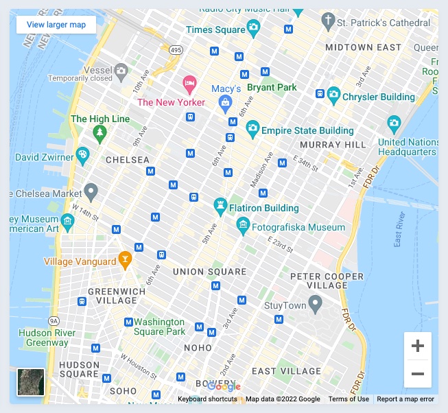
Format
Option self.format is useful when you want to format the data that result returns from query.
Example without format:
class Avo::Cards::AmountRaised < Avo::Cards::MetricCard
  self.id = "amount_raised"
  self.label = "Amount raised"
  self.prefix = "$"

  def query
    result 9001
  end
end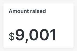
Example with format:
class Avo::Cards::AmountRaised < Avo::Cards::MetricCard
  self.id = "amount_raised"
  self.label = "Amount raised"
  self.prefix = "$"
  self.format = -> {
    number_to_social value, start_at: 1_000
  }

  def query
    result 9001
  end
end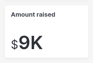
Metric card
The metric card is your friend when you only need to display a simple big number. To generate one run bin/rails g avo:card users_metric --type metric.
Calculate results
To calculate your result, you may use the query method. After you make the query, use the result method to store the value displayed on the card.
In the query method you have access to a few variables like context (the App context), params (the request params), range (the range that was requested), dashboard, resource or parent (the current dashboard or resource the card is on), and current card.
class Avo::Cards::UsersMetric < Avo::Cards::MetricCard
self.id = 'users_metric'
self.label = 'Users count'
self.description = 'Some tiny description'
self.cols = 1
# self.rows = 1
# self.initial_range = 30
# self.ranges = {
# "7 days": 7,
# "30 days": 30,
# "60 days": 60,
# "365 days": 365,
# Today: "TODAY",
# "Month to date": "MTD",
# "Quarter to date": "QTD",
# "Year to date": "YTD",
# All: "ALL",
# }
# self.prefix = '$'
# self.suffix = '%'
# self.refresh_every = 10.minutes
def query
from = Date.today.midnight - 1.week
to = DateTime.current
Decorate the data using prefix and suffix
Some metrics might want to add a prefix or a suffix to display the data better.
class Avo::Cards::UsersMetric < Avo::Cards::MetricCard
  self.id = 'users_metric'
  self.prefix = '$'
  self.suffix = '%'
end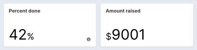
Since v3.13
prefix and suffix became callable options.The blocks are executed using Avo::ExecutionContext. Within this blocks, you gain access to all attributes of Avo::ExecutionContext along with the parent.
class Avo::Cards::UsersMetric < Avo::Cards::MetricCard
  self.id = 'users_metric'
  self.prefix = -> { params[:prefix] || parent.prefix }
  self.suffix = -> { params[:suffix] || parent.suffix }
end
Chartkick card
A picture is worth a thousand words. So maybe a chart a hundred? Who knows? But creating charts in Avo is very easy with the help of the chartkick gem.
You start by running bin/rails g avo:card users_chart --type chartkick.
class Avo::Cards::UserSignups < Avo::Cards::ChartkickCard
  self.id = 'user_signups'
  self.label = 'User signups'
  self.chart_type = :area_chart
  self.description = 'Some tiny description'
  self.cols = 2
  # self.rows = 1
  # self.chart_options = { library: { plugins: { legend: { display: true } } } }
  # self.flush = true
  # self.legend = false
  # self.scale = false
  # self.legend_on_left = false
  # self.legend_on_right = false

  def query
    points = 16
    i = Time.new.year.to_i - points
    base_data =
      Array
        .new(points)
        .map do
          i += 1
          [i.to_s, rand(0..20)]
        end
        .to_h

    data = [
      { name: 'batch 1', data: base_data.map { |k, v| [k, rand(0..20)] }.to_h },
      { name: 'batch 2', data: base_data.map { |k, v| [k, rand(0..40)] }.to_h },
      { name: 'batch 3', data: base_data.map { |k, v| [k, rand(0..10)] }.to_h }
    ]

    result data
  end
end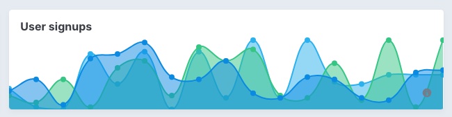
Chart types
Using the self.chart_type class attribute you can change the type of the chart. Supported types are line_chart, pie_chart, column_chart, bar_chart, area_chart, and scatter_chart.
Customize chart
Because the charts are being rendered with padding initially, we offset that before rendering to make the chart look good on the card. To disable that, you can set self.flush = false. That will set the chart loose for you to customize further.
After you set flush to false, you can add/remove the scale and legend. You can also place the legend on the left or right using legend_on_left and legend_on_right.
These are just some of the predefined options we provide out of the box, but you can send different chartkick options to the chart using chart_options.
If you'd like to use Groupdate, Hightop, and ActiveMedian you should require them in your Gemfile. Only chartkick is required by default.
chart.js is supported for the time being. So if you need support for other types, please reach out or post a PR (🙏 PRs are much appreciated).
self.chartkick_options accepts callable blocks:
class Avo::Cards::ExampleAreaChart < Avo::Cards::ChartkickCard
  self.chart_options: -> do
    {
      library: {
        plugins: {
          legend: {display: true}
        }
      }
    }
  end
end
chartkick_options can also be declared when registering the card:
class Avo::Dashboards::Dashy < Avo::Dashboards::BaseDashboard
  def cards
    card Avo::Cards::ExampleAreaChart,
      chart_options: {
        library: {
          plugins: {
            legend: {display: true}
          }
        }
      }

    # OR

    card Avo::Cards::ExampleAreaChart,
      chart_options: -> do
        {
          library: {
            plugins: {
              legend: {display: true}
            }
          }
        }
      end
  end
end
The blocks are executed using Avo::ExecutionContext. Within this blocks, you gain access to all attributes of Avo::ExecutionContext along with the parent, arguments and result_data.
Partial card
You can use a partial card to add custom content to a card. Generate one by running bin/rails g avo:card custom_card --type partial. That will create the card class and the partial for it.
class Avo::Cards::ExampleCustomPartial < Avo::Cards::PartialCard
  self.id = "users_custom_card"
  self.cols = 1
  self.rows = 4
  self.partial = "avo/cards/custom_card"
  # self.display_header = true
end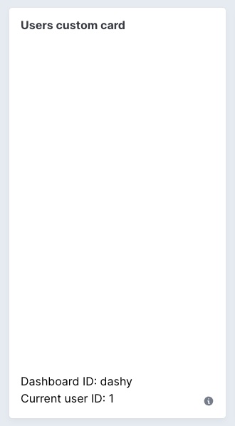
You can embed a piece of content from another app using an iframe. You can hide the header using the self.display_header = false option. That will render the embedded content flush to the container.
# app/avo/cards/map_card.rb
class Avo::Cards::MapCard < Avo::Cards::PartialCard
  self.id = "map_card"
  self.label = "Map card"
  self.partial = "avo/cards/map_card"
  self.display_header = false
  self.cols = 2
  self.rows = 4
end<!-- app/views/avo/cards/_map_card.html.erb -->
<iframe src="https://www.google.com/maps/embed?pb=!1m14!1m12!1m3!1d17991.835132857846!2d-73.98926852562143!3d40.742050491245955!2m3!1f0!2f0!3f0!3m2!1i1024!2i768!4f13.1!5e0!3m2!1sen!2sro!4v1647079626880!5m2!1sen!2sro" width="100%" height="100%" style="border:0;" allowfullscreen="" loading="lazy"></iframe>Cards visibility
Since v2.28It's common to show the same card to multiple types of users (admins, regular users). In that scenario you might want to hide some cards for the regular users and show them just to the admins.
You can use the visible option to do that. It can be a boolean or a block where you can access the params, current_user, context, parent, and card object.
class Avo::Cards::UsersCount < Avo::Cards::MetricCard
  self.id = "users_metric"
  self.label = "Users count"
  self.visible = -> do
    # You have access to:
    # context
    # params
    # parent (the current dashboard or resource)
    # dashboard (will be nil when parent is resource)
    # resource (will be nil when parent is dashboard)
    # current card
    true
  end

  def query
    result User.count
  end
end
You may also control the visibility from the parent class.
class Avo::Dashboards::Dashy < Avo::Dashboards::BaseDashboard
  def cards
    card Avo::Cards::UsersCount, visible: -> { true }
  end
endclass Avo::Resources::User < Avo::BaseResource
def cards
card Avo::Cards::UsersCount, visible: -> { true }
end
endDividers
You may want to separate the cards. You can use dividers to do that.
class Avo::Dashboards::Dashy < Avo::Dashboards::BaseDashboard
  def cards
    card Avo::Cards::ExampleColumnChart
    card Avo::Cards::ExamplePieChart
    card Avo::Cards::ExampleBarChart
    divider label: "Custom partials"
    card Avo::Cards::ExampleCustomPartial
    card Avo::Cards::MapCard
  end
end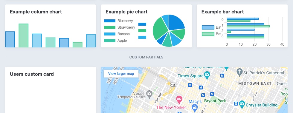
Dividers can be a simple line between your cards or have some text on them that you control using the label option. When you don't want to show the line, you can enable the invisible option, which adds the divider but does not display a border or label.
Dividers visibility
Since v2.28You might want to conditionally show/hide a divider based on a few factors. You can do that using the visible option.
divider label: "Custom partials", visible: -> {
  # You have access to:
  # context
  # params
  # parent (the current dashboard or resource)
  # dashboard (will be nil when parent is resource)
  # resource (will be nil when parent is dashboard)
  true
}
View-specific card methods
Since v3.24.0Similar to view-specific field methods like index_fields and show_fields, resources can define view-specific card methods to control which cards render on each page.
Resolution order by view
| View | Specific method | Context fallback | Final fallback |
|---|---|---|---|
| Index | index_cards | display_cards | cards |
| Show | show_cards | display_cards | cards |
| New | new_cards | form_cards | cards |
| Edit | edit_cards | form_cards | cards |
Avo picks the first method available in the order listed above for the current view.
Example
Assume this card class:
class Avo::Cards::AmountRaised < Avo::Cards::MetricCard
  self.id = "amount_raised"
  self.label = "Amount raised"
  self.prefix = "$"
  self.format = -> {
    number_to_social value, start_at: 1_000
  }

  def query
    result 9001
  end
end
Define where it should appear on the Project resource:
class Avo::Resources::Project < Avo::BaseResource
  # Show page uses `show_cards` first
  def show_cards
    card Avo::Cards::AmountRaised
  end

  # Index and show pages fall back to `display_cards` only when
  # their specific method (`index_cards`/`show_cards`) is not defined
  def display_cards
    card Avo::Cards::AmountRaised
  end

  # New and edit pages fall back to `form_cards` when `new_cards`/`edit_cards` are not defined
  def form_cards
    card Avo::Cards::AmountRaised
  end
end
With the setup above, the card will render on the Project show page via show_cards. If you remove show_cards, Avo will use display_cards for the show page. For new/edit pages, Avo will use form_cards unless you define new_cards or edit_cards respectively.