Customizable controls
One of the things that we wanted to support from day one is customizable controls on resource pages, and now, Avo supports customizable controls on Index, Show, and Edit views and for the table row.
Default controls
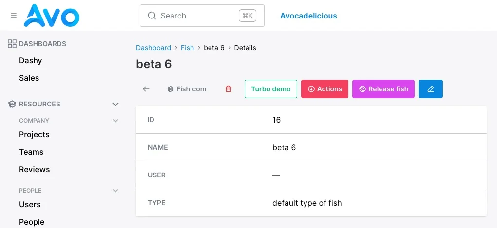
By default, Avo displays a few buttons (controls) for the user to use on the Index, Show, and Edit views which you can override using the appropriate resource options.
Customize the controls
You can take over and customize them all using the index_controls, show_controls, edit_controls, and row_controls class attributes.
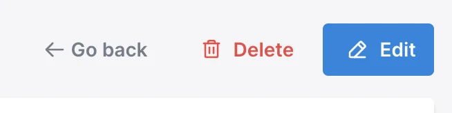
-> Show page
On the Show view the default configuration is back_button, delete_button, detach_button, actions_list, and edit_button.
To start customizing the controls, add a show_controls block and start adding the desired controls.
class Avo::Resources::Fish < Avo::BaseResource
  self.show_controls = -> do
    back_button label: "", title: "Go back now"
    link_to "Fish.com", "https://fish.com", icon: "heroicons/outline/academic-cap", target: :_blank
    link_to "Turbo demo", "/admin/resources/fish/#{params[:id]}?change_to=🚀🚀🚀 New content here 🚀🚀🚀",
      class: ".custom-class",
      data: {
        turbo_frame: "fish_custom_action_demo"
      }
    delete_button label: "", title: "something"
    detach_button label: "", title: "something"
    actions_list label: "Runnables", exclude: [ReleaseFish], style: :primary, color: :slate
    action Avo::Actions::ReleaseFish, style: :primary, color: :fuchsia, icon: "heroicons/outline/globe"
    edit_button label: ""
  end
end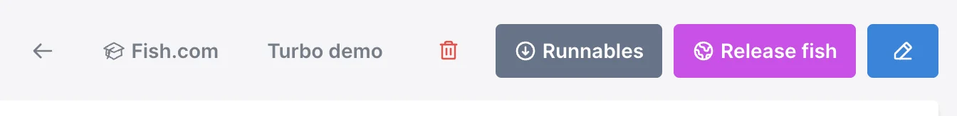
-> Edit page
On the Edit view the default configuration is back_button, delete_button, actions_list, and save_button.
To start customizing the controls, add a edit_controls block and start adding the desired controls.
class Avo::Resources::Fish < Avo::BaseResource
  self.edit_controls = -> do
    back_button label: "", title: "Go back now"
    link_to "Fish.com", "https://fish.com", icon: "heroicons/outline/academic-cap", target: :_blank
    delete_button label: "", title: "something"
    detach_button label: "", title: "something"
    actions_list exclude: [Avo::Actions::ReleaseFish], style: :primary, color: :slate, label: "Runnables"
    action Avo::Actions::ReleaseFish, style: :primary, color: :fuchsia, icon: "heroicons/outline/globe" if view != :new
    save_button label: "Save Fish"
  end
end
-> Index page
On the Index view the default configuration contains the actions_list, attach_button, and create_button.
To start customizing the controls, add a index_controls block and start adding the desired controls.
class Avo::Resources::Fish < Avo::BaseResource
  self.index_controls = -> do
    link_to "Fish.com", "https://fish.com", icon: "heroicons/outline/academic-cap", target: :_blank
    actions_list exclude: [Avo::Actions::DummyAction], style: :primary, color: :slate, label: "Runnables" if Fish.count > 0
    action Avo::Actions::DummyAction, style: :primary, color: :fuchsia, icon: "heroicons/outline/globe" if Fish.count > 0
    attach_button label: "Attach one Fish"
    create_button label: "Create a new and fresh Fish"
  end
end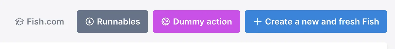
-> Row controls
On the Index view the on the end of each table row the default configuration contains the order_controls show_button, edit_button, detach_button, and delete_button.
To start customizing the controls, add a row_controls block and start adding the desired controls.
The controls you customize here will be displayed on the grid view too.
class Avo::Resources::Fish < Avo::BaseResource
  self.row_controls = -> do
    action Avo::Actions::ReleaseFish, label: "Release #{record.name}", style: :primary, color: :blue,
      icon: "heroicons/outline/hand-raised" unless params[:view_type] == "grid"
    edit_button title: "Edit this Fish now!"
    show_button title: "Show this Fish now!"
    delete_button title: "Delete this Fish now!", confirmation_message: "Are you sure you want to delete this Fish?"
    actions_list style: :primary, color: :slate, label: "Actions" unless params[:view_type] == "grid"
    action Avo::Actions::ReleaseFish, title: "Release #{record.name}", icon: "heroicons/outline/hand-raised", style: :icon
    link_to "Information about #{record.name}", "https://en.wikipedia.org/wiki/#{record.name}",
      icon: "heroicons/outline/information-circle", target: :_blank, style: :icon
  end
end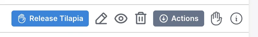
Controls
A control is an item that you can place in a designated area. They can be one of the default ones like back_button, delete_button, or edit_button to custom ones like link_to or action.
You may use the following controls:
-> back_button
Links to a previous page. The link is not a history.back() action. It's computed based on the parameters sent by Avo. That ensures the user has consistent hierarchical progress through the app.
Supported options
label, title, style, color, and icon.
-> delete_button
Adds the appropriate destroy form. It will take into account your authorization policy rules.
Supported options
label, title, style, color, and icon.
-> detach_button
Adds the appropriate detach form. It's visible only on the association (has_one) page. It will take into account your authorization policy rules.
Supported options
label, title, style, color, and icon.
-> actions_list
A dropdown where the user can see and run all the actions assigned to that resource.
Supported options
label, title, style, color, icon, include and exclude.
exclude option
Filters out the specified actions.
It's used in conjunction with the action control. For example, when you extract an action, you don't want it to be displayed in the actions_list anymore, so you use the exclude option to filter it out.
Example
actions_list exclude: Avo::Actions::DisableAccount
# Or
actions_list exclude: [Avo::Actions::ExportSelection, Avo::Actions::PublishPost]
include option
This option is used to specify the actions that should be included in the actions_list. When this option is configured, only the actions specified in the include option will be displayed in the actions_list dropdown.
Example
actions_list include: Avo::Actions::DisableAccount
# Or
actions_list include: [Avo::Actions::ExportSelection, Avo::Actions::PublishPost]
-> list
A dropdown that displays all the specified actions and links.
Supported options
label, title, style, color and icon
Example
list label: "Custom Index List", icon: "heroicons/outline/cube-transparent", style: :primary, color: :slate, title: "A custom list" do
  link_to "Google", "https://google.com", icon: "heroicons/outline/academic-cap"
  action Avo::Actions::Sub::DummyAction, icon: "heroicons/outline/globe"
  link_to "Fish.com", "https://fish.com", icon: "heroicons/outline/fire", target: :_blank
end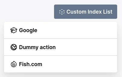
Within the list block, the only permitted elements are link_to and action. For both link_to and action, you can include an optional icon parameter.
In addition to the icon, the link_to element can accept additional parameters such as target: :_blank or rel: "noopener", or any other extra arguments you may want to provide for the link. These extra arguments help define specific behaviors for the link, like opening it in a new tab or ensuring security best practices are followed.
-> edit_button
-> link_to
Renders a link to a path set by you.
Supported options
title, style, color, icon, target, data, and class.
-> action
Renders a button that triggers an action. You must provide it an Action class.
Supported options
title, style, color, arguments and icon.
Example
action Avo::Actions::DisableAccount
action Avo::Actions::DisableAccount, arguments: { hide_some_fields: true }
action Avo::Actions::ExportSelection, style: :text
action Avo::Actions::PublishPost, color: :fuchsia, icon: "heroicons/outline/eye"
WARNING (NOT applicable for versions greater than 3.10.7)
When you use the action helper in any customizable block it will act only as a shortcut to display the action button, it will not also register it to the resource.
You must manually register it with the action declaration.
class Avo::Resources::Fish < Avo::BaseResource
  self.title = :name

  self.show_controls = -> do
    # In order to use it here
    action Avo::Actions::ReleaseFish, style: :primary, color: :fuchsia, arguments: {
      action_on_show_controls: "Will use this arguments"
    }
  end

  # 👇 Also declare it here 👇
  def actions
    action Avo::Actions::ReleaseFish, arguments: {
      action_from_list: "Will use this arguments"
    }
  end
end
-> default_controls
There are times when you just want to add a link before or after the default controls and don't want to re-add them all. Avo's got you covered! default_controls to the rescue.
self.show_controls = -> do
  # This link will be added before all other controls.
  link_to "View on site", post_path(record), target: :_blank
  default_controls
end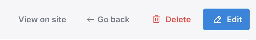
Control Options
Some controls take options. Not all controls take all options. Example: The link_to control is the only one that will take the target option, but most other controls use the class option.
-> title
-> style
-> color
Sets the color attribute for the Avo::ButtonComponent
Possible values
Can be any color of Tailwind`s default color pallete as a symbol.
-> icon
Sets the icon for that button.
Possible values
Any Heroicon you want. You must specify the style of the heroicon like so heoricons/outline/academic-cap or heroicons/solid/adjustments.
-> target
Sets the target for that control. So whatever you pass here will be passed to the control.
Possible values
:_blank, :_top, :_self
-> class
Default values
If you're curious what are the default controls Avo adds for each block, here they are:
# show controls
back_button
delete_button
detach_button
actions_list
edit_button

# form (edit & new) controls
back_button
delete_button
actions_list
save_button

# index controls
attach_button
actions_list
create_button

# row controls
order_controls
show_button
edit_button
detach_button
delete_button
Conditionally hiding/showing actions
Actions have the visible block where you can control the visibility of an action. In the context of show_controls that block is not taken into account, but you can use regular if/else statements because the action declaration is wrapped in a block.
class Avo::Resources::Fish < Avo::BaseResource
  self.show_controls = -> do
    back_button label: "", title: "Go back now"

    # visibility conditional
    if record.something?
      action Avo::Actions::ReleaseFish, style: :primary, color: :fuchsia, icon: "heroicons/outline/globe"
    end

    edit_button label: ""
  end
end