Grid view
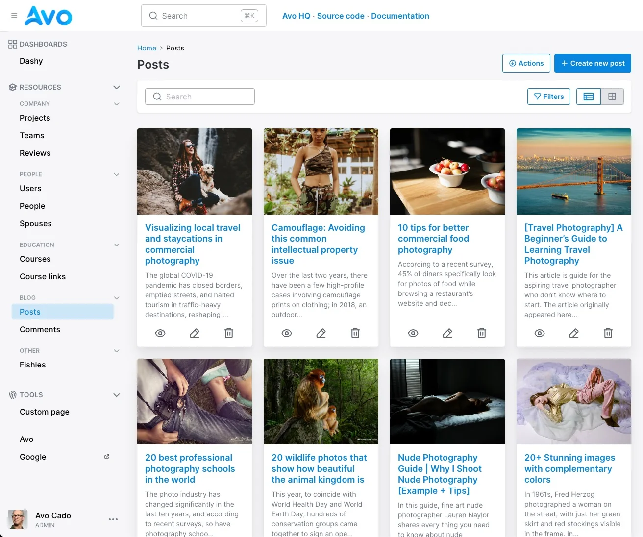
Some resources are best displayed in a grid view. We can do that with Avo using a cover_url, a title, and a body.
Enable grid view
To enable grid view for a resource, you need to configure the grid_view class attribute on the resource. That will add the grid view to the view switcher on the Index view.
class Avo::Resources::Post < Avo::BaseResource
  self.grid_view = {
    card: -> do
      {
        cover_url:
          if record.cover_photo.attached?
            main_app.url_for(record.cover_photo.url)
          end,
        title: record.name,
        body: record.truncated_body
      }
    end
  }
end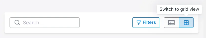
Make default view
To make the grid the default way of viewing a resource Index, we have to use the default_view_type class attribute.
class Avo::Resources::Post < Avo::BaseResource
  self.default_view_type = :grid
end
Custom style
You may want to customize the card a little bit. That's possible using the html option.
class Avo::Resources::Post < Avo::BaseResource
  self.grid_view = {
    card: -> do
      {
        cover_url:
          if record.cover_photo.attached?
            main_app.url_for(record.cover_photo.url)
          end,
        title: record.name,
        body: record.truncated_body
      }
    end,
    html: -> do
      {
        title: {
          index: {
            wrapper: {
              classes: "bg-blue-50 rounded-md p-2"
            }
          }
        },
        body: {
          index: {
            wrapper: {
              classes: "bg-gray-50 rounded-md p-1"
            }
          }
        },
        cover: {
          index: {
            wrapper: {
              classes: "blur-sm"
            }
          }
        }
      }
    end
  }
end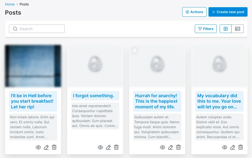
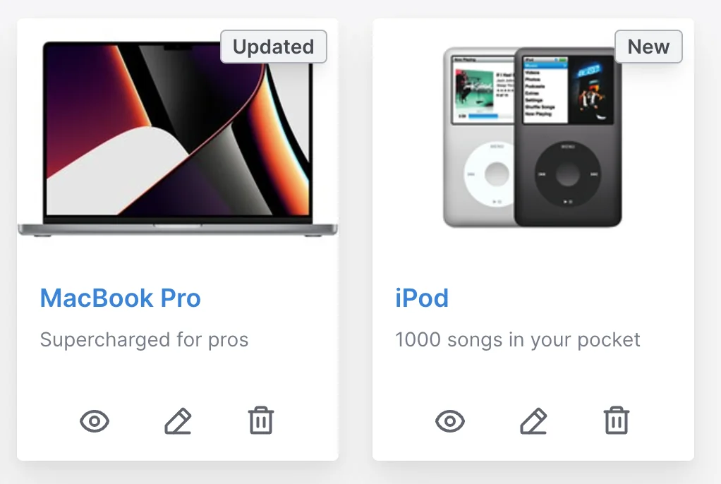
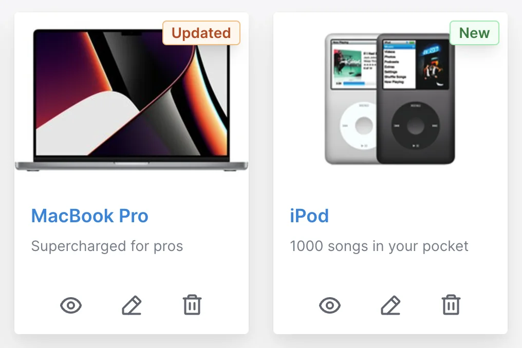
Grid Item Badge
Since v3.15
One common scenario is to show a badge on top of your grid items. Avo enables you to do that pretty easy using these three options.
-> badge_label
The label is what the user sees on top of your grid item.
self.grid_view = {
  card: -> do
    {
      cover_url: record.image.attached? ? main_app.url_for(record.image.variant(resize: "300x300")) : nil,
      title: record.title,
      body: simple_format(record.description),
      badge_label: (record.updated_at < 1.week.ago ? "New" : "Updated"),
    }
  end
}
-> badge_color
You may style it in any TailwindCSS color you prefer.
It only needs to know the color name (green, blue, fuchsia, etc.).
self.grid_view = {
  card: -> do
    {
      cover_url: record.image.attached? ? main_app.url_for(record.image.variant(resize: "300x300")) : nil,
      title: record.title,
      body: simple_format(record.description),
      badge_label: (record.updated_at < 1.week.ago ? "New" : "Updated"),
      badge_color: (record.updated_at < 1.week.ago ? "green" : "orange")
    }
  end
}
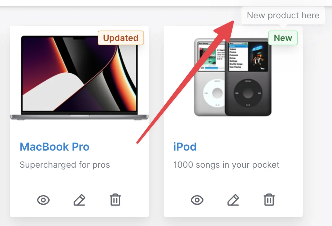
-> badge_title
The title refers to the tooltip that the user gets when they hover over the badge.
self.grid_view = {
  card: -> do
    {
      cover_url: record.image.attached? ? main_app.url_for(record.image.variant(resize: "300x300")) : nil,
      title: record.title,
      body: simple_format(record.description),
      badge_label: (record.updated_at < 1.week.ago ? "New" : "Updated"),
      badge_color: (record.updated_at < 1.week.ago ? "green" : "orange"),
      badge_title: (record.updated_at < 1.week.ago ? "New product here" : "Updated product here")
    }
  end
}