Avo::PanelComponent
The panel component is one of the most used components in Avo.
<%= render Avo::PanelComponent.new(title: @product.name, description: @product.description) do |c| %>
  <% c.with_tools do %>
    <%= a_link(@product.link, icon: 'heroicons/solid/academic-cap', style: :primary, color: :primary) do %>
      View product
    <% end %>
  <% end %>

  <% c.with_body do %>
    <div class="flex flex-col p-4 min-h-24">
      <div class="space-y-4">
        <h3>Product information</h3>

        <p>Style: shiny</p>
      </div>
    </div>
  <% end %>
<% end %>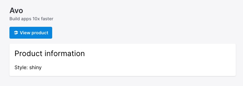
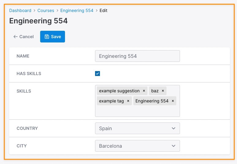
Options
All options are optional. You may render a panel without options.
<%= render Avo::PanelComponent.new do |c| %>
  <% c.with_body do %>
    Something here.
  <% end %>
<% end %>
-> name
-> description
-> classes
-> body_classes
-> data
-> display_breadcrumbs
Slots
The component has a few slots where you customize the content in certain areas.
-> tools
We created this slot as a place to put resource controls like the back, edit, delete, and detach buttons. This slot will collapse under the title and description when the screen resolution falls under 1024px.
The section is automatically aligned to the right using justify-end class.
<%= render Avo::PanelComponent.new(name: "Dashboard") do |c| %>
  <% c.with_tools do %>
    <%= a_link('/admin', icon: 'heroicons/solid/academic-cap', style: :primary) do %>
      Admin
    <% end %>
  <% end %>
<% end %>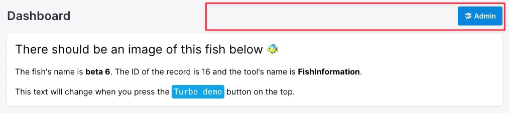
-> body
This is one of the main slots of the component where the bulk of the content is displayed.
<%= render Avo::PanelComponent.new do |c| %>
  <% c.with_body do %>
    Something here.
  <% end %>
<% end %>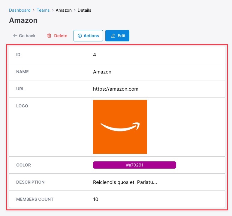
-> bare_content
Used when displaying the Grid view, it displays the data flush in the container and with no background.
<%= render Avo::PanelComponent.new do |c| %>
  <% c.with_bare_content do %>
    Something here.
  <% end %>
<% end %>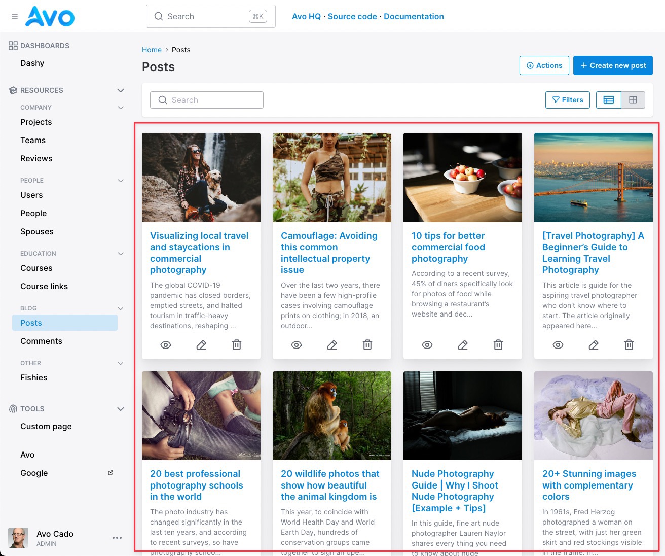
-> footer_tools
This is pretty much the same slot as tools but rendered under the body or bare_content slots.
<%= render Avo::PanelComponent.new do |c| %>
  <% c.with_footer_controls do %>
    Something here.
  <% end %>
<% end %>
-> footer
The lowest available area at the end of the component.
<%= render Avo::PanelComponent.new do |c| %>
  <% c.with_footer do %>
    Something here.
  <% end %>
<% end %>
-> sidebar
The sidebar will conveniently show things in a smaller area on the right of the body.
<%= render Avo::PanelComponent.new do |c| %>
  <% c.with_Sidebar do %>
    Something tiny here.
  <% end %>
<% end %>