How to safely override the resource views without maintaining core components
Sometimes it's the small things in a UI that make a big impact. One of those things is being able to show a helpful message at the top of an index view page. This is typically where users land to see lists of posts, products, orders, or anything else. You might want to point out something important, offer quick guidance, or simply highlight a recent change.
INFO
What makes this guide particularly valuable is that it demonstrates how to safely override and customize the resource index component without having to maintain the original index component on each version update. While we'll be focusing on the index component in this guide, this technique can be applied to any resource view component in Avo. This approach lets you add custom functionality while still benefiting from Avo's updates to the core components, ensuring your customizations remain compatible across upgrades.
That's where this guide comes in. I'll walk you through how to inject a custom message at the top of the index view. We'll do this by creating a new component that extends the one Avo already uses to render index pages, setting it as the default for specific resources (or all of them), and customizing the view to display our message cleanly above the list.
Let's jump in.
Create a new view component
Start by generating a new view component that inherits from Avo's index view:
rails generate component Avo::Views::ResourceCustomIndex --parent=Avo::Views::ResourceIndexComponentThis will generate three files:
# app/components/avo/views/resource_custom_index_component.rb
# frozen_string_literal: true

class Avo::Views::ResourceCustomIndexComponent < Avo::Views::ResourceIndex
end<!-- components/avo/views/resource_custom_index_component.html.erb -->
<div>Add Avo::Views::ResourceCustomIndexComponent template here</div># test/components/avo/views/resource_custom_index_component_test.rb
# frozen_string_literal: true
require "test_helper"
class Avo::Views::ResourceCustomIndexeComponentTest < ViewComponent::TestCase
def test_component_renders_something_useful
# assert_equal(
# %(<span>Hello, components!</span>),
# render_inline(Avo::Views::ResourceCustomIndexeComponent.new(message: "Hello, components!")).css("span").to_html
# )
end
endTIP
You can delete the generated test file test/components/avo/views/resource_custom_index_component_test.rb since we won't cover testing in this guide.
Use the custom component in a resource
Let's apply the new component to a specific resource. I'll use the Movie resource as an example.
Update the resource file (Avo::Resources::Movie) to use the new component via the self.components configuration:
# app/avo/resources/movie.rb
class Avo::Resources::Movie < Avo::Resources::ArrayResource
self.components = {
"Avo::Views::ResourceIndexComponent": Avo::Views::ResourceCustomIndexComponent
}
# ...
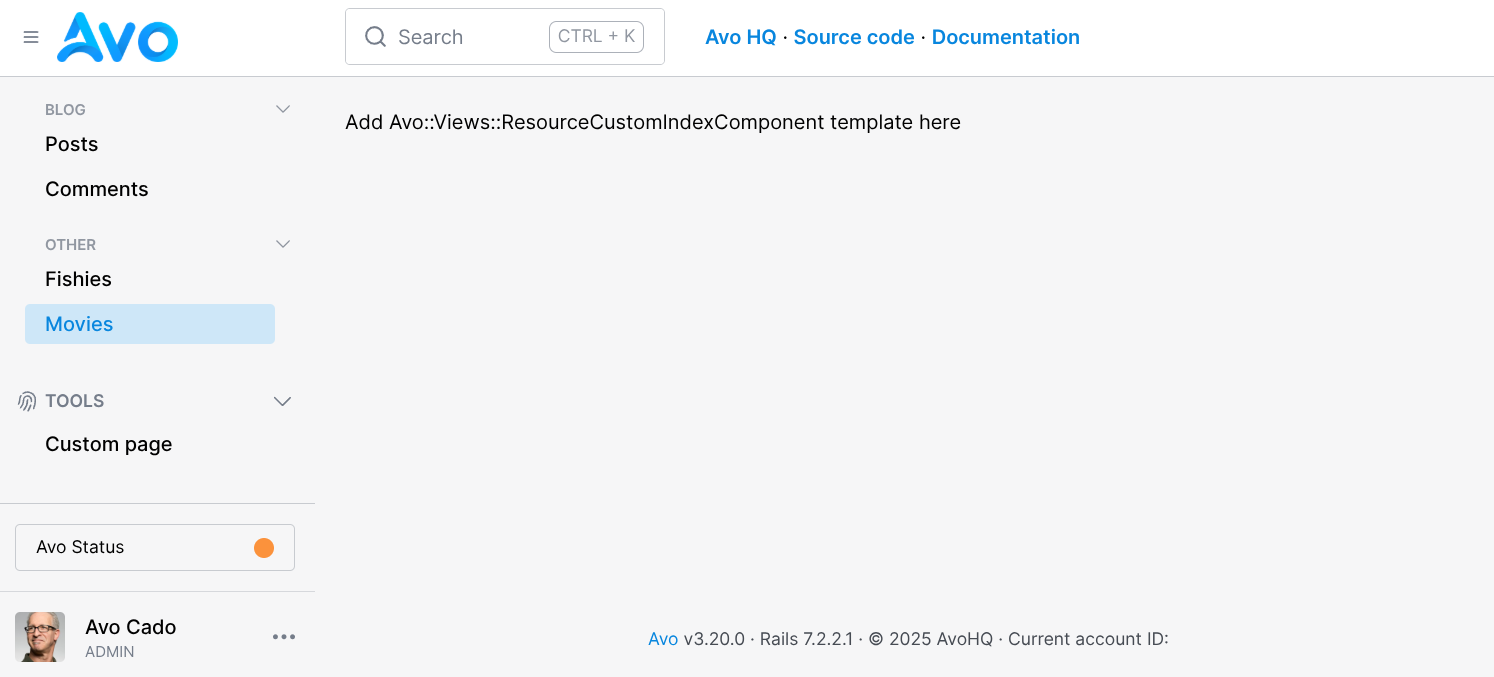
endNow when you visit the Movies resource page, it will render the custom component, currently just showing the placeholder text.
Render the parent view and add your message
Next, let's modify the component so it wraps the original Avo index component and adds a message on top.
Avo will now call this custom component first, let's update the Ruby component file to store all keyword arguments, and use those to render the parent component.
# app/components/avo/views/resource_custom_index_component.rb
# frozen_string_literal: true

class Avo::Views::ResourceCustomIndexComponent < Avo::Views::ResourceIndex
  def initialize(**kwargs)
    @kwargs = kwargs
  end
end
Update the ERB template to render a message above the original component:
WARNING
All Tailwind CSS classes used in this guide are already part of Avo's design system and included in its pre-purged assets. If you plan to customize the appearance of the message component beyond what's shown here, you may need to set up the TailwindCSS integration.
<!-- app/components/avo/views/resource_custom_index_component.html.erb -->
<div>Add Avo::Views::ResourceCustomIndexComponent template here</div>
<div class="flex flex-col">
<div class=" w-full shadow-lg rounded px-2 py-3 rounded relative border text-white pointer-events-auto bg-blue-400 border-blue-600 mb-4">
<div class="flex h-full">
<div class="ml-3 w-0 flex-1 pt-0.5">
<p class="text-sm leading-5 font-semibold">
<strong>MovieFest 2025</strong> • Discover what\'s trending this season in cinema 🍿
</p>
</div>
</div>
</div>
<%= render Avo::Views::ResourceIndexComponent.new(**@kwargs) %>
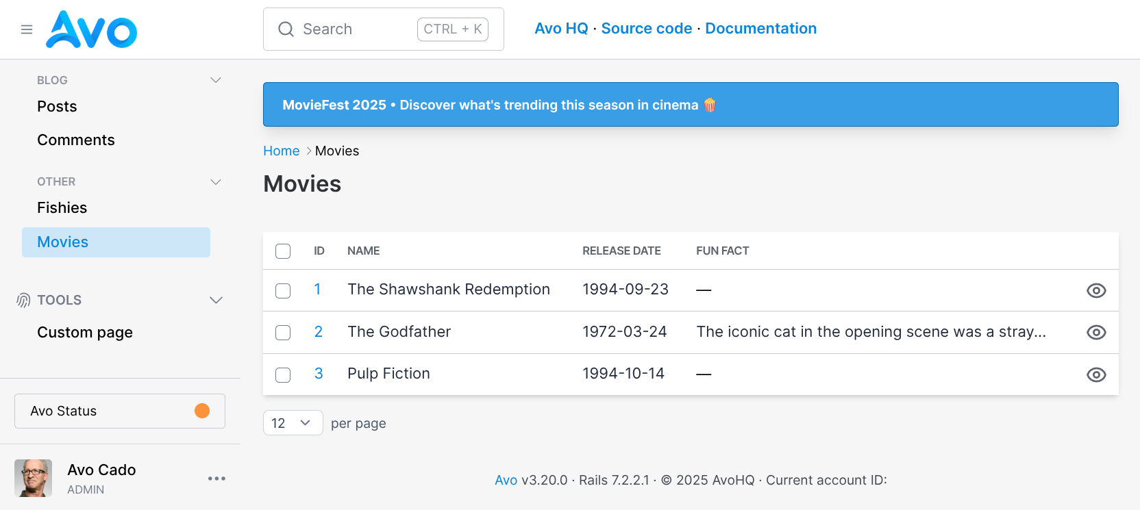
</div> Now when you visit the Movies resource page, it will render the custom component that shows the original component and your custom message on top. 🎉🎉🎉
Apply this component to all the resources
You can apply the new component to each resource individually by setting self.components, but there's a more efficient approach. Since all your resources inherit from Avo::BaseResource, we can centralize this configuration by extending that base class.
To do this, override the base resource class by creating or modifying app/avo/base_resource.rb:
# app/avo/base_resource.rb
module Avo
  class BaseResource < Avo::Resources::Base
    self.components = {
      "Avo::Views::ResourceIndexComponent": Avo::Views::ResourceCustomIndexComponent
    }
  end
end
Now you can remove this configuration from the Movie resource:
# app/avo/resources/movie.rb
class Avo::Resources::Movie < Avo::Resources::ArrayResource
  self.components = {
    "Avo::Views::ResourceIndexComponent": Avo::Views::ResourceCustomIndexComponent
  }

  # ...
end
With this change in place, every resource will automatically use the custom index component, no extra configuration needed. However, that raises a practical question: what if some resources should have a message, and others shouldn't?
Let's make the component more flexible by introducing a lightweight DSL extension.
Make the message configurable via a resource method
To turn our static message into something dynamic and optional we'll fetch the message from a method on each resource. If a resource defines the index_message method, the component will render it. If not, it won’t show anything.
Let’s update the Ruby component to support this:
# app/components/avo/views/resource_custom_index_component.rb
# frozen_string_literal: true

class Avo::Views::ResourceCustomIndexComponent < Avo::Views::ResourceIndex
  def initialize(**kwargs)
    @kwargs = kwargs
    @index_message = kwargs[:resource].try(:index_message)
  end
end
Now tweak the view to conditionally render the message:
<!-- app/components/avo/views/resource_custom_index_component.html.erb -->
<div class="flex flex-col">
  <% if @index_message.present? %>
    <div class=" w-full shadow-lg rounded px-2 py-3 rounded relative border text-white pointer-events-auto bg-blue-400 border-blue-600 mb-4">
      <div class="flex h-full">
        <div class="ml-3 w-0 flex-1 pt-0.5">
          <p class="text-sm leading-5 font-semibold">
            <strong>MovieFest 2025</strong> • Discover what\'s trending this season in cinema 🍿
            <%= @index_message %>
          </p>
        </div>
      </div>
    </div>
  <% end %>

  <%= render Avo::Views::ResourceIndexComponent.new(**@kwargs) %>
</div>
To use this, just add an index_message method to any resource:
# app/avo/resources/movie.rb
class Avo::Resources::Movie < Avo::Resources::ArrayResource
  def index_message
    '<strong>MovieFest 2025</strong> • Discover what\'s trending this season in cinema 🍿'.html_safe
  end

  # ...
end
Wrapping up
Adding contextual messages to index pages can go a long way in making your internal tool more helpful. With this approach, you've learned how to:
- Extend Avo's default index view component
- Add custom UI above the resource index table
- Apply the enhancement globally across all resources
- Keep it flexible using a simple per-resource DSL
This solution is modular, declarative, and easy to maintain. You can now provide dynamic guidance to your users where it makes the most sense.
The beauty of this approach is that it safely overrides and customizes the resource index component without requiring you to maintain the original index component on each version update. While we've focused on adding a message at the top, this pattern opens horizons for extending the index component in any direction, whether adding elements at the bottom, on the sides, or anywhere else your application needs. You get the flexibility of customization while continuing to benefit from Avo's ongoing improvements to the core components.