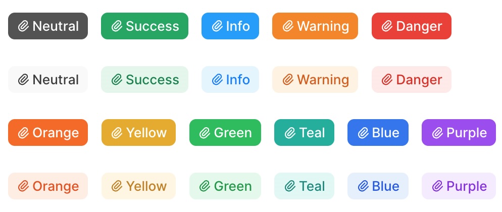
Badge
The badge field is used to display an easily recognizable status of a record.

field :status, as: :badge,
  options: {
    success: "Done",
    danger: "Cancelled",
    warning: "On hold",
    green: "In review",
    purple: "Idea"
  }
Description
The Badge field displays a colored indicator with optional icons. You can customize the color through the options mapping, and the style and icon for each value dynamically using procs.
The Badge field is intended to be displayed only on Index and Show views. To update the value shown by the badge field, use another field like Text or Select with hide_on: [:index, :show].
Options
-> options
Maps field values to badge colors. Keys are color names (semantic or base colors), and values can be a single value (string/symbol) or an array of values that should display with that color.
Available colors
Base colors: red, orange, amber, yellow, lime, green, emerald, teal, cyan, sky, blue, indigo, violet, purple, fuchsia, pink, rose
Semantic colors: neutral, success, danger, warning, info
Default behavior
If a value doesn't match any of the configured options, it will default to neutral.
# Map values to colors
field :status, as: :badge,
  options: {
    success: ["Done", :completed],      # Arrays with mixed types
    danger: "Cancelled",                # Single string
    warning: :pending,                  # Single symbol
    violet: "Idea"                      # Base color
  }
-> style
Controls the badge appearance style.
Available styles
subtle- Light background with colored text (default)solid- Solid colored background with white text
Default behavior
If an invalid style is provided, it will default to subtle.
field :status, as: :badge,
  options: { success: :done },
  style: "solid"

# Or dynamically
field :status, as: :badge,
  options: { success: :done },
  style: -> { record.completed? ? "solid" : "subtle" }
-> icon
Adds an icon to the badge.
field :status, as: :badge,
  options: { success: :done },
  icon: "heroicons/outline/check-circle"

# Or dynamically
field :status, as: :badge,
  options: { success: :done },
  icon: -> {
    record.approved? ? "heroicons/outline/check-circle" : "heroicons/outline/x-circle"
  }
Examples
Using semantic colors
field :status, as: :badge,
  options: {
    success: ["active", "completed"],
    info: ["pending", "review"],
    danger: ["failed", "cancelled"],
    neutral: ["unknown"]
  }
Using base colors
field :priority, as: :badge,
  options: {
    green: :low,
    amber: :medium,
    orange: :high,
    red: :urgent
  }
Using Badge with a Select field for editing
Since Badge is display-only, pair it with a Select field to allow editing:
field :stage,
  as: :select,
  hide_on: [:show, :index],
  options: {
    'Discovery': :discovery,
    'Idea': :idea,
    'Done': :done,
    'On hold': 'on hold',
    'Cancelled': :cancelled,
    'Drafting': :drafting
  },
  placeholder: 'Choose the stage.'

field :stage,
  as: :badge,
  options: {
    info: ["Discovery", "Idea"],
    success: :Done,
    warning: "On hold",
    danger: "Cancelled",
    neutral: :Drafting
  },
  style: -> { ["Done", "Cancelled"].include?(record.stage) ? "solid" : "subtle" },
  icon: -> {
    {
      "Discovery" => "tabler/outline/zoom",
      "Idea" => "tabler/outline/bulb",
      "Drafting" => "tabler/outline/file-text",
      "Done" => "tabler/outline/circle-check",
      "On hold" => "tabler/outline/player-pause",
      "Cancelled" => "tabler/outline/xbox-x"
    }[record.stage]
  }