
Cards
Cards are one way of quickly adding custom content for your users.
Cards can be used on dashboards or resources, we'll refer to both of them as "parent" since they're hosting the cards.
You can add six types of cards to your parent: partial, html, metric, chartkick, table, and list.
Base settings
All cards have some standard settings like id, which must be unique, label, description, and discreet_description. The label is the title of your card, the description is a subtitle rendered below the title, and the discreet_description shows a tiny info icon at the bottom-right of the card with a tooltip containing the text.
Each card has its own cols and rows settings to control the width and height of the card inside the parent's grid. cols takes values from 1 to 6; rows takes values from 1 to 12.
All these settings can be set to a lambda.
The lambda will be executed using Avo::ExecutionContext. Within this blocks, you gain access to all attributes of Avo::ExecutionContext along with the parent, resource, dashboard and card.
class Avo::Cards::UsersMetric < Avo::Cards::MetricCard
  self.id = "users_metric"
  self.label = -> { "Users count" }
  self.description = -> { "Users description" }
  self.discreet_description = -> { "How this number is calculated" }
  self.cols = 1
  self.rows = 1
  self.display_header = true
end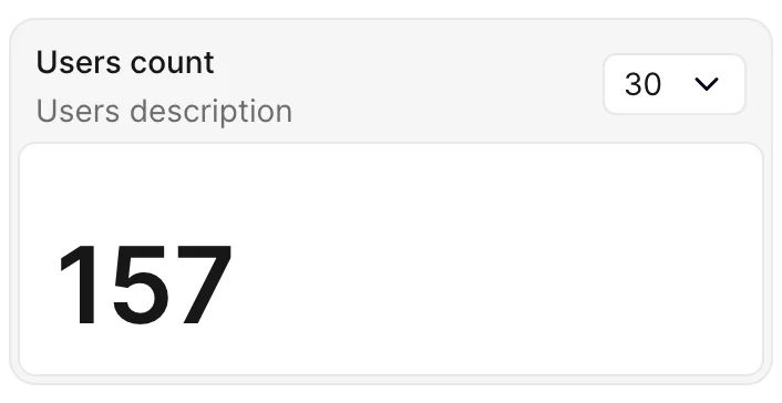
description
Renders directly under the card's title as a subtitle. Use it when the extra context is always relevant and should be visible at a glance.
class Avo::Cards::UsersMetric < Avo::Cards::MetricCard
  self.label = "Users count"
  self.description = "Across all teams and workspaces"
end
discreet_description
Renders a small info icon in the bottom-right corner of the card. Hovering it shows a tooltip with the text. Use it for secondary context that would otherwise clutter the card — methodology notes, data source disclaimers, definitions, etc.
class Avo::Cards::UsersMetric < Avo::Cards::MetricCard
  self.label = "Users count"
  self.discreet_description = "Counts only active, non-deleted users created in the selected range."
end
Both options accept a lambda evaluated through Avo::ExecutionContext, with access to parent, resource, dashboard, card, arguments and params:
class Avo::Cards::UsersMetric < Avo::Cards::MetricCard
  self.discreet_description = -> { "Computed at #{Time.current.to_fs(:short)}" }
end
You can also override either option per-registration on the parent dashboard or resource:
class Avo::Dashboards::Dashy < Avo::Dashboards::BaseDashboard
  def cards
    card Avo::Cards::UsersMetric,
      description: "Signups this week",
      discreet_description: "Includes invited users who have not yet confirmed."
  end
end
Ranges
Control the aggregation using ranges
You may also want to give the user the ability to query data in different ranges. You can control what's passed in the dropdown using the ranges attribute. The array passed here will be parsed and displayed on the card. All integers are transformed to days, and other string variables will be passed as they are.
You can also set a default range using the initial_range attribute.
The parameter you pass to the range option will be directly passed to the options_for_select helper, so it behaves more like a regular select_tag.
class Avo::Cards::UsersMetric < Avo::Cards::MetricCard
  self.id = 'users_metric'
  self.label = 'Users count'
  self.initial_range = 30
  self.ranges = {
    "7 days": 7,
    "30 days": 30,
    "60 days": 60,
    "365 days": 365,
    Today: "TODAY",
    "Month to date": "MTD",
    "Quarter to date": "QTD",
    "Year to date": "YTD",
    All: "ALL"
  }
end
Keep the data fresh
If the parent is something that you keep on the big screen, you need to keep the data fresh at all times. That's easy using refresh_every. You pass the number of seconds you need to be refreshed and forget about it. Avo will do it for you.
class Avo::Cards::UsersMetric < Avo::Cards::MetricCard
  self.id = 'users_metric'
  self.refresh_every = 10.minutes
end
Refresh a card on demand
Sometimes an interval is the wrong tool — someone runs an action, comes back, and wants that one number brought up to date now. A card can carry a refresh control for exactly that. Turn it on with refresh_button:
class Avo::Cards::UsersMetric < Avo::Cards::MetricCard
  self.id = 'users_metric'
  self.refresh_button = true
end
It's off by default, matching the dashboard-wide button. Put it on the cards where re-running the query means something — an HTML or partial card re-renders identical content, so a control there does nothing.
The control sits at the end of the card header, next to the ranges dropdown. On a card that renders no header at all — one with no label, description, or ranges, or one that hides its header — it floats in the card's top corner instead, so the card keeps its original height.
A manual refresh re-runs only that card's query and swaps that card in place — the rest of the page is untouched. It keeps whatever range the viewer has selected rather than snapping back to initial_range, and preserves any dashboard filters that are applied.
On a card that also sets refresh_every, refreshing by hand restarts that countdown. On one that sets cache_for, it bypasses the cache and re-runs the query.
Cache an expensive query
When a card's query is slow — an aggregate over a large table, a call to an external service — you rarely need it recomputed on every page load. Give it cache_for and Avo stores the result for that long, skipping the query entirely until it expires.
class Avo::Cards::UsersMetric < Avo::Cards::MetricCard
  self.id = 'users_metric'
  self.cache_for = 5.minutes

  def query
    result User.where(active: true).count
  end
end
Entries are scoped to the current user and tenant, so a card querying current_user is safe to cache. Each range is cached separately too, and on a resource card each record gets its own entry. If your query varies on something else, override cache_key as shown in the reference.
Someone clicking the card's refresh control is asking for current data, so that click re-runs the query and rewrites the entry — but only their own, since the key is per user. Automatic refresh_every polling still respects cache_for, which is what makes the two worth pairing: poll often, query rarely.
WARNING
Partial and HTML cards build their content at render time instead of running a query, so cache_for does nothing for them. Wrap the markup in Rails' own cache block instead.
Hide the header
In cases where you need to embed some content that should fill the whole card (like a map, for example), you can choose to hide the label and ranges dropdown with display_header.
class Avo::Cards::UsersMetric < Avo::Cards::MetricCard
  self.id = 'users_metric'
  self.display_header = false
end
Like the other base settings it also takes a block, so the header can come and go with the viewer or the card's parent.
self.display_header = -> { !parent.is_a?(Avo::Dashboards::Kiosk) }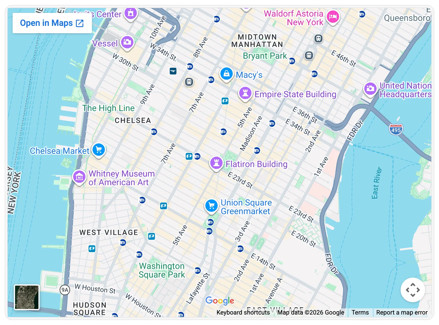
Format
Option self.format is useful when you want to format the data that result returns from query.
Example without format:
class Avo::Cards::AmountRaised < Avo::Cards::MetricCard
  self.id = "amount_raised"
  self.label = "Amount raised"
  self.prefix = "$"

  def query
    result 9001
  end
end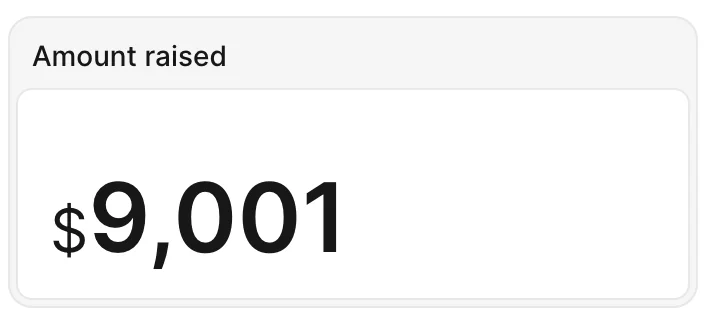
Example with format:
class Avo::Cards::AmountRaised < Avo::Cards::MetricCard
  self.id = "amount_raised"
  self.label = "Amount raised"
  self.prefix = "$"
  self.format = -> {
    number_to_social value, start_at: 1_000
  }

  def query
    result 9001
  end
end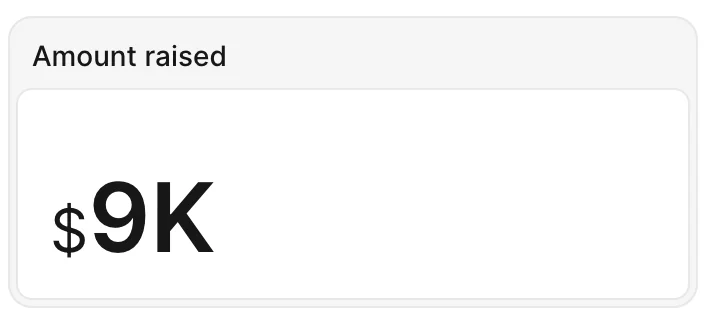
Metric card
The metric card is your friend when you only need to display a simple big number. To generate one run bin/rails g avo:card users_metric --type metric.
Calculate results
To calculate your result, you may use the query method. After you make the query, use the result method to store the value displayed on the card.
In the query method you have access to a few variables like context (the App context), params (the request params), range (the range that was requested), dashboard, resource or parent (the current dashboard or resource the card is on), and current card.
class Avo::Cards::UsersMetric < Avo::Cards::MetricCard
self.id = 'users_metric'
self.label = 'Users count'
self.description = 'Some tiny description'
self.cols = 1
# self.rows = 1
# self.initial_range = 30
# self.ranges = {
# "7 days": 7,
# "30 days": 30,
# "60 days": 60,
# "365 days": 365,
# Today: "TODAY",
# "Month to date": "MTD",
# "Quarter to date": "QTD",
# "Year to date": "YTD",
# All: "ALL",
# }
# self.prefix = '~'
# self.suffix = '%'
# self.refresh_every = 10.minutes
def query
from = Date.today.midnight - 1.week
to = DateTime.current
Decorate the data using prefix and suffix
Some metrics might want to add a prefix or a suffix to display the data better.
class Avo::Cards::UsersMetric < Avo::Cards::MetricCard
  self.id = 'users_metric'
  self.prefix = '~'
  self.suffix = '%'
end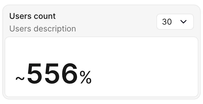
prefix and suffix can be configured using a Proc.
Within this block, you gain access to all attributes of Avo::ExecutionContext along with the parent.
class Avo::Cards::UsersMetric < Avo::Cards::MetricCard
  self.id = 'users_metric'
  self.prefix = -> { params[:prefix] || parent.prefix }
  self.suffix = -> { params[:suffix] || parent.suffix }
end
Chartkick card
A picture is worth a thousand words. So maybe a chart a hundred? Who knows? But creating charts in Avo is very easy with the help of the chartkick gem.
You start by running bin/rails g avo:card users_chart --type chartkick.
class Avo::Cards::UserSignups < Avo::Cards::ChartkickCard
  self.id = 'user_signups'
  self.label = 'User signups'
  self.chart_type = :area_chart
  self.description = 'Some tiny description'
  self.cols = 2
  # self.rows = 1
  # self.chart_options = { library: { plugins: { legend: { display: true } } } }
  # self.flush = true
  # self.legend = false
  # self.scale = false
  # self.legend_on_left = false
  # self.legend_on_right = false

  def query
    points = 16
    i = Time.new.year.to_i - points
    base_data =
      Array
        .new(points)
        .map do
          i += 1
          [i.to_s, rand(0..20)]
        end
        .to_h

    data = [
      { name: 'batch 1', data: base_data.map { |k, v| [k, rand(0..20)] }.to_h },
      { name: 'batch 2', data: base_data.map { |k, v| [k, rand(0..40)] }.to_h },
      { name: 'batch 3', data: base_data.map { |k, v| [k, rand(0..10)] }.to_h }
    ]

    result data
  end
end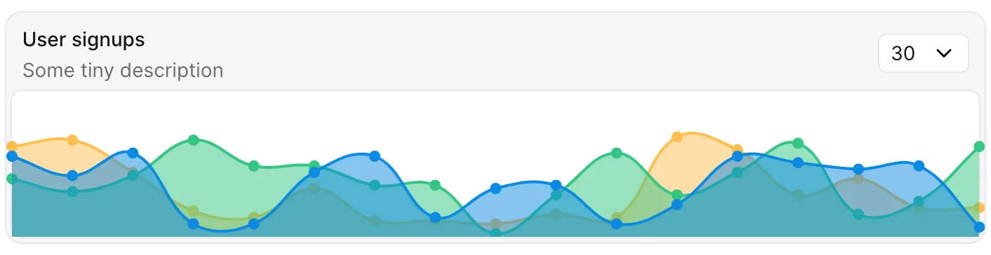
Chart types
Using the self.chart_type class attribute you can change the type of the chart. Supported types are line_chart, pie_chart, column_chart, bar_chart, area_chart, and scatter_chart.
Customize chart
Because the charts are being rendered with padding initially, we offset that before rendering to make the chart look good on the card. To disable that, you can set self.flush = false. That will set the chart loose for you to customize further.
After you set flush to false, you can add/remove the scale and legend. You can also place the legend on the left or right using legend_on_left and legend_on_right.
These are just some of the predefined options we provide out of the box, but you can send different chartkick options to the chart using chart_options.
If you'd like to use Groupdate, Hightop, and ActiveMedian you should require them in your Gemfile. Only chartkick is required by default.
chart.js is supported for the time being. So if you need support for other types, please reach out or post a PR (🙏 PRs are much appreciated).
self.chart_options accepts callable blocks:
class Avo::Cards::ExampleAreaChart < Avo::Cards::ChartkickCard
  self.chart_options = -> do
    {
      library: {
        plugins: {
          legend: {display: true}
        }
      }
    }
  end
end
chart_options can also be declared when registering the card:
class Avo::Dashboards::Dashy < Avo::Dashboards::BaseDashboard
  def cards
    card Avo::Cards::ExampleAreaChart,
      chart_options: {
        library: {
          plugins: {
            legend: {display: true}
          }
        }
      }

    # OR

    card Avo::Cards::ExampleAreaChart,
      chart_options: -> do
        {
          library: {
            plugins: {
              legend: {display: true}
            }
          }
        }
      end
  end
end
The blocks are executed using Avo::ExecutionContext. Within this blocks, you gain access to all attributes of Avo::ExecutionContext along with the parent, arguments and result_data.
Partial card
You can use a partial card to add custom content to a card. Generate one by running bin/rails g avo:card custom_card --type partial. That will create the card class and the partial for it.
class Avo::Cards::ExampleCustomPartial < Avo::Cards::PartialCard
  self.id = "users_custom_card"
  self.cols = 1
  self.rows = 4
  self.partial = "avo/cards/custom_card"
  # self.display_header = false
end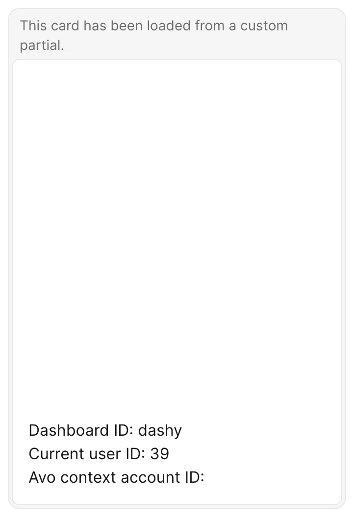
You can embed a piece of content from another app using an iframe. You can hide the header using the self.display_header = false option. That will render the embedded content flush to the container.
# app/avo/cards/map_card.rb
class Avo::Cards::MapCard < Avo::Cards::PartialCard
  self.id = "map_card"
  self.label = "Map card"
  self.partial = "avo/cards/map_card"
  self.display_header = false
  self.cols = 2
  self.rows = 4
end<!-- app/views/avo/cards/_map_card.html.erb -->
<iframe
src="https://www.google.com/maps/embed?pb=!1m14!1m12!1m3!1d17991.835132857846!2d-73.98926852562143!3d40.742050491245955!2m3!1f0!2f0!3f0!3m2!1i1024!2i768!4f13.1!5e0!3m2!1sen!2sro!4v1647079626880!5m2!1sen!2sro"
width="100%"
height="100%"
style="border:0;"
allowfullscreen=""
loading="lazy"
></iframe>HTML card
Since v4.1When the content is simple enough that a dedicated partial file feels like overhead, use an HTML card and build the body straight from Ruby. Implement a body method — every view helper (tag, safe_join, link_to, number_to_currency, render, main_app, …) is available directly on the card, and the return value can take three shapes.
This is a great place for your LLM to take over and spit out a version of HTML.
Inline ERB string
Return a plain string and it's compiled as an inline ERB template. The template has access to all view helpers plus a card local.
# app/avo/cards/newest_users.rb
class Avo::Cards::NewestUsers < Avo::Cards::HtmlCard
  self.id = "newest_users"
  self.label = "Newest users"

  def body
    <<~ERB
      <ul class="divide-y divide-neutral-100">
        <% User.order(created_at: :desc).limit(5).each do |user| %>
          <li class="flex justify-between gap-2 px-4 py-2">
            <%= link_to user.name, main_app.user_path(user) %>
            <span class="text-content-secondary"><%= user.email %></span>
          </li>
        <% end %>
      </ul>
    ERB
  end
end
For passing data in explicitly, call render inline: yourself with locals: — the result renders the same way:
def body
  render inline: "<strong><%= count %></strong> signups", locals: {count: User.count}
end
Tag builder
Return tag builder output:
def body
  tag.div class: "px-4 py-2" do
    safe_join([
      tag.strong(number_to_currency(149.99)),
      tag.span("Total raised", class: "text-content-secondary")
    ])
  end
end
Renderables
Return anything render accepts — a View Component instance, a {partial:} hash — and the card renders it:
def body
  MyStatsComponent.new(user: current_user)
enddef body
{partial: "avo/cards/my_stats", locals: {user: current_user}}
endWARNING
Inline templates go through ActionView, so interpolated values (<%= user.name %>) are HTML-escaped as usual. However, never build the template string itself from user input — pass dynamic values through ERB tags or locals:, not Ruby string interpolation.
Table card
Since v4.1Use a table card to show a list of things — latest sign-ups, top products, failed jobs — styled like Avo's index table but fed by any query. Declare the columns as fields — the same DSL you use on resources — and return records from query.
# app/avo/cards/latest_users.rb
class Avo::Cards::LatestUsers < Avo::Cards::TableCard
  self.id = "latest_users"
  self.label = "Latest users"
  self.cols = 2
  self.rows = 2

  def fields
    field :name, as: :text, name: "User", link_to_record: true
    field :email, as: :text, protocol: :mailto
    field :active, as: :badge, name: "Status", options: {success: "Active"} do
      record.active? ? "Active" : "Inactive"
    end
  end

  def query
    result User.order(created_at: :desc).limit(10)
  end
end
Each record from result becomes one row, and each field becomes one cell. Cells render through the same components as the resource Index views, so every field type and option — computed blocks, format_using, link_to_record, badge options:, and the rest — behaves exactly like it does on an index table.
INFO
The records you return must have an Avo resource registered for their model — the card resolves and renders fields through it.
Table cards are for top-N data — cap the row count in your query with limit. There is no pagination or sorting; if you need the full table experience, use a resource's index view instead.
Headers
Column headers derive from the field names. Pass name: to override one:
field :created_at, as: :date, name: "Joined"If you don't need column headers at all, you probably want the list card instead.
Row links
Set row_url to make every row a link. The block runs per row with record in scope:
self.row_url = -> { record_path(record) }For a new tab or a tooltip, return a hash instead — the same semantics as discreet information:
self.row_url = -> {
  {url: record_path(record), target: :_blank, tooltip: "View #{record.name}"}
}- Each hash value may itself be a block receiving
record. urlacceptshttp,https,mailto, and relative URLs; anything else (likejavascript:) is ignored.- List card rows render a real anchor stretched over the row, so middle-click, copy-link, and no-JS navigation work. Table rows navigate through the same JavaScript as
click_row_to_view_recordon index tables — a<tr>can't be wrapped in an anchor. Either way, links inside the row (like amailto:cell) still win over the row link.
Density
Rows use the global config.density unless the card overrides it with density:
self.density = :tight # :tight, :normal, :relaxedEmpty state
When the query returns no rows the card shows a translated "No record found" message. Override it per card with empty_message:
self.empty_message = "No sign-ups this week"
# or
self.empty_message = -> { I18n.t("cards.no_signups") }
Ranges and refreshing
Table cards support the same ranges, initial_range, and refresh_every settings as every other card. The selected range is available as range inside query — using it as the query's limit is a common pattern.
WARNING
refresh_every reloads the whole card, which resets the scroll position of a tall table. Prefer it on short tables.
The card's rows setting also caps the table's height — rows past the cap scroll inside the card, with the column headers staying pinned.
List card
Since v4.1Use a list card whenever you want to show a list of things without table semantics — it renders a real <ul>, not a <table>, and there are no column headers. The first field is each row's primary content and every other field trails at the end edge — great for badges, booleans, or timestamps.
# app/avo/cards/active_users.rb
class Avo::Cards::ActiveUsers < Avo::Cards::ListCard
  self.id = "active_users"
  self.label = "Active users"
  self.row_url = -> { record_path(record) }

  def fields
    field :name, as: :text
    field :email, as: :text
    field :active, as: :boolean
  end

  def query
    result User.active.order(:name).limit(5)
  end
end
Fields, row links, density, the empty state, empty_message, ranges, and the height cap all work the same way as on the table card.
Cards visibility
It's common to show the same card to multiple types of users (admins, regular users). In that scenario you might want to hide some cards for the regular users and show them just to the admins.
You can use the visible option to do that. It can be a boolean or a block where you can access the params, current_user, context, parent, and card object.
class Avo::Cards::UsersCount < Avo::Cards::MetricCard
  self.id = "users_metric"
  self.label = "Users count"
  self.visible = -> do
    # You have access to:
    # context
    # params
    # parent (the current dashboard or resource)
    # dashboard (will be nil when parent is resource)
    # resource (will be nil when parent is dashboard)
    # current card
    true
  end

  def query
    result User.count
  end
end
You may also control the visibility from the parent class.
class Avo::Dashboards::Dashy < Avo::Dashboards::BaseDashboard
  def cards
    card Avo::Cards::UsersCount, visible: -> { true }
  end
endclass Avo::Resources::User < Avo::BaseResource
def cards
card Avo::Cards::UsersCount, visible: -> { true }
end
endDividers
You may want to separate the cards. You can use dividers to do that.
class Avo::Dashboards::Dashy < Avo::Dashboards::BaseDashboard
  def cards
    card Avo::Cards::ExampleColumnChart
    card Avo::Cards::ExamplePieChart
    card Avo::Cards::ExampleBarChart
    divider label: "Custom partials"
    card Avo::Cards::ExampleCustomPartial
    card Avo::Cards::MapCard
  end
end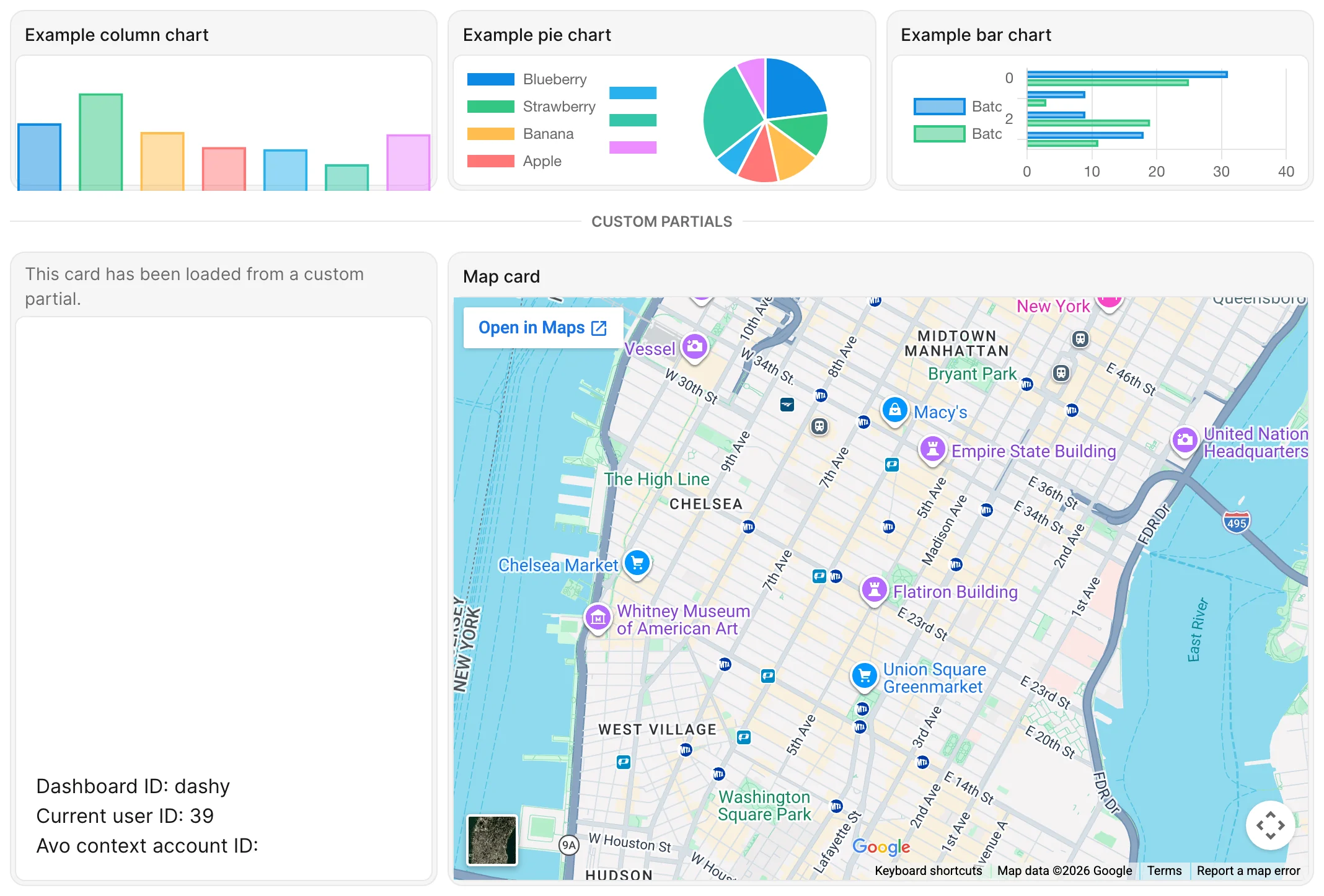
Dividers can be a simple line between your cards or have some text on them that you control using the label option. When you don't want to show the line, you can enable the invisible option, which adds the divider but does not display a border or label.
Dividers visibility
You might want to conditionally show/hide a divider based on a few factors. You can do that using the visible option.
divider label: "Custom partials", visible: -> {
  # You have access to:
  # context
  # params
  # parent (the current dashboard or resource)
  # dashboard (will be nil when parent is resource)
  # resource (will be nil when parent is dashboard)
  true
}
View-specific card methods
Similar to view-specific field methods like index_fields and show_fields, resources can define view-specific card methods to control which cards render on each page.
Resolution order by view
| View | Specific method | Context fallback | Final fallback |
|---|---|---|---|
| Index | index_cards | display_cards | cards |
| Show | show_cards | display_cards | cards |
| New | new_cards | form_cards | cards |
| Edit | edit_cards | form_cards | cards |
Avo picks the first method available in the order listed above for the current view.
Example
Assume this card class:
class Avo::Cards::AmountRaised < Avo::Cards::MetricCard
  self.id = "amount_raised"
  self.label = "Amount raised"
  self.prefix = "$"
  self.format = -> {
    number_to_social value, start_at: 1_000
  }

  def query
    result 9001
  end
end
Define where it should appear on the Project resource:
class Avo::Resources::Project < Avo::BaseResource
  # Show page uses `show_cards` first
  def show_cards
    card Avo::Cards::AmountRaised
  end

  # Index and show pages fall back to `display_cards` only when
  # their specific method (`index_cards`/`show_cards`) is not defined
  def display_cards
    card Avo::Cards::AmountRaised
  end

  # New and edit pages fall back to `form_cards` when `new_cards`/`edit_cards` are not defined
  def form_cards
    card Avo::Cards::AmountRaised
  end
end
With the setup above, the card will render on the Project show page via show_cards. If you remove show_cards, Avo will use display_cards for the show page. For new/edit pages, Avo will use form_cards unless you define new_cards or edit_cards respectively.