Grid view
Some resources are best displayed in a grid view. We can do that with Avo using a cover_url, a title, and a body.
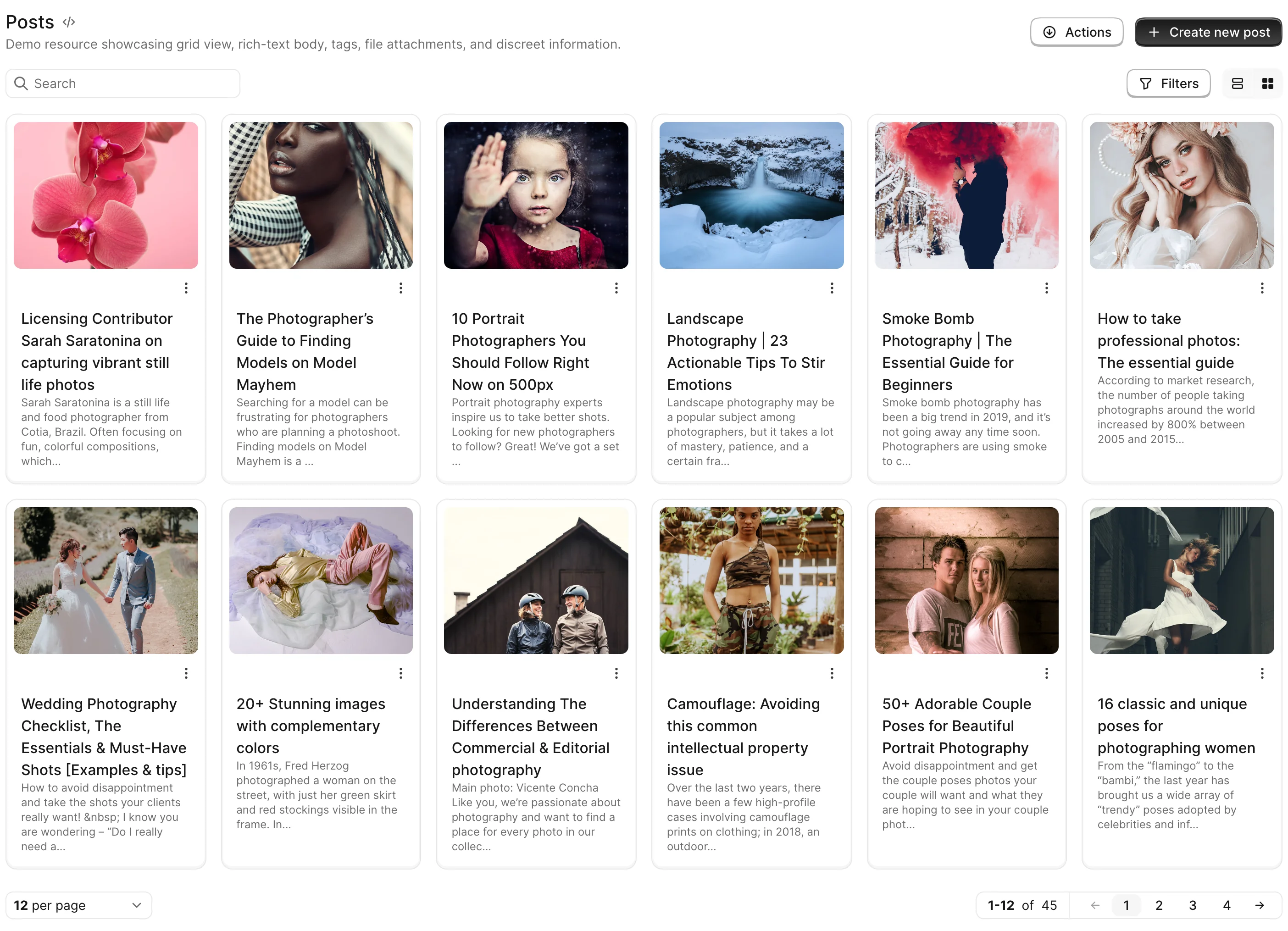
Enable grid view
To enable grid view for a resource, you need to configure the grid_view class attribute on the resource. That will add the grid view to the view switcher on the Index view.
class Avo::Resources::Post < Avo::BaseResource
  self.grid_view = {
    card: -> do
      {
        cover_url:
          if record.cover_photo.attached?
            main_app.url_for(record.cover_photo.url)
          end,
        title: record.name,
        body: record.truncated_body
      }
    end
  }
end
Options
Next, you should configure a few things for the grid card.
-> title
What should be used as the title of the card.
self.grid_view = {
  card: -> do
    {
      title: record.title
    }
  end
}
-> body
What should be used as the body of the card. You can use this field to display a description of the record.
self.grid_view = {
  card: -> do
    {
      body: record.truncated_body
    }
  end
}
-> cover_url
What should be used as the cover URL of the card.
self.grid_view = {
  card: -> do
    {
      cover_url: record.image.attached? ? main_app.url_for(record.image.variant(resize_to_fill: [300, 300])) : nil
    }
  end
}
If nil is given, a default placeholder image will be used.
-> badge
Optionally you may add a badge to give more context to the card or make it stand out.
See below a list of options you can configure for the badge.
Make grid the default view
To make the grid the default way of viewing a resource Index, we have to use the default_view_type class attribute.
class Avo::Resources::Post < Avo::BaseResource
  self.default_view_type = :grid
end
Custom style
You may want to customize the card a little bit. That's possible using the html option.
class Avo::Resources::Post < Avo::BaseResource
  self.grid_view = {
    card: -> do
      {
        cover_url:
          if record.cover_photo.attached?
            main_app.url_for(record.cover_photo.url)
          end,
        title: record.name,
        body: record.truncated_body
      }
    end,
    html: -> do
      {
        title: {
          index: {
            wrapper: {
              classes: "bg-blue-50 dark:bg-blue-900 rounded-md p-2"
            }
          }
        },
        body: {
          index: {
            wrapper: {
              classes: "bg-gray-50 dark:bg-gray-800 rounded-md p-1"
            }
          }
        },
        cover: {
          index: {
            wrapper: {
              classes: "blur-sm"
            }
          }
        }
      }
    end
  }
end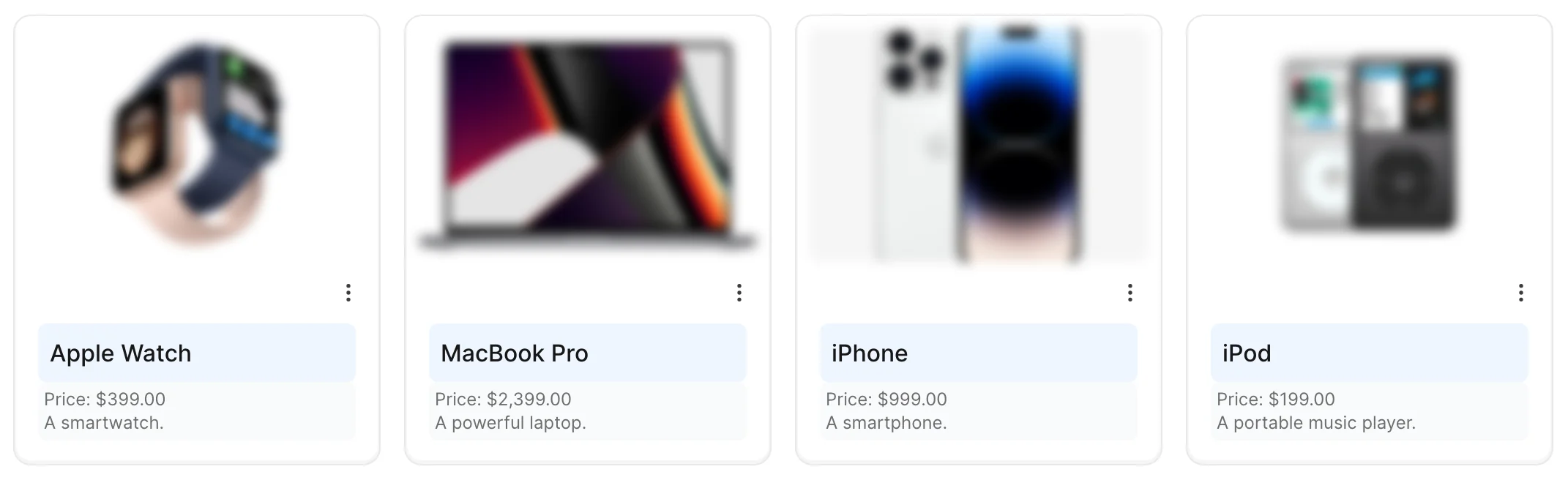
Grid Item Badge
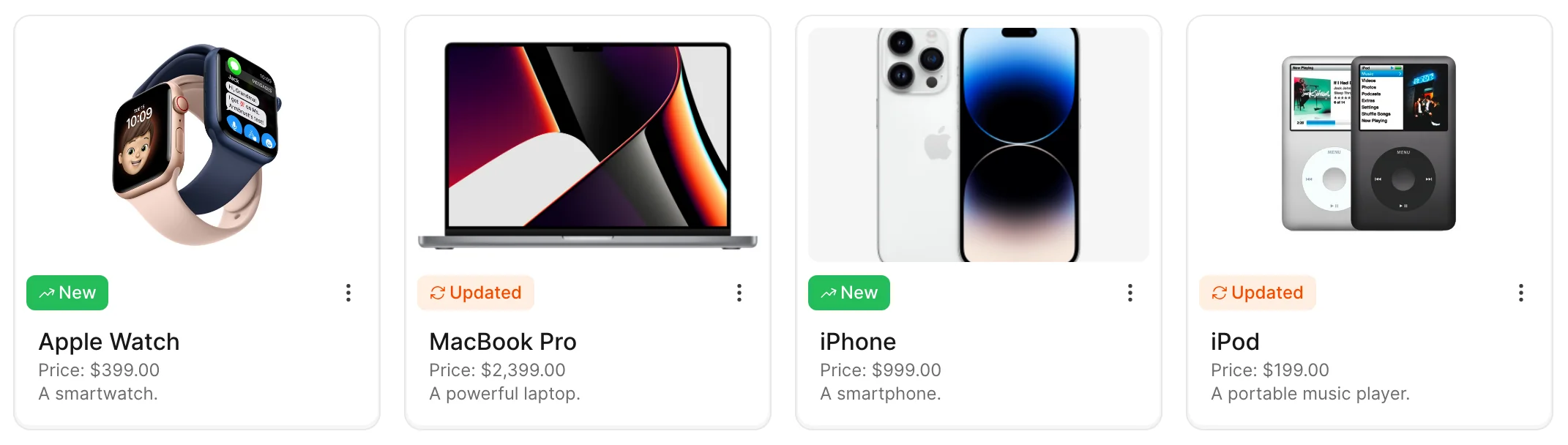
You can display and customize a badge on top of your grid items. Badges are useful for showing status indicators, labels, or other visual cues that help users quickly identify important information about each item.
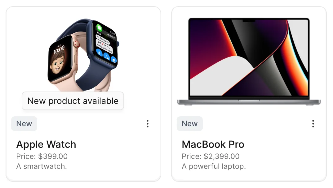
Complete Example
# Dynamic badge based on record status
self.grid_view = {
  card: -> do
    {
      cover_url: record.image.attached? ? main_app.url_for(record.image.variant(resize_to_fill: [300, 300])) : nil,
      title: record.title,
      body: simple_format(record.description),
      badge: {
        label: record.new? ? "New" : "Updated",
        color: record.new? ? "green" : "orange",
        style: record.new? ? "solid" : "subtle",
        title: record.new? ? "New product available" : "Recently updated",
        icon: record.new? ? "heroicons/outline/arrow-trending-up" : "heroicons/outline/arrow-path"
      }
    }
  end
}
Options
-> label
The visible text displayed on the badge. This is the primary content that users will see on your grid items.
self.grid_view = {
  card: -> do
    {
      badge: { label: "New" }
    }
  end
}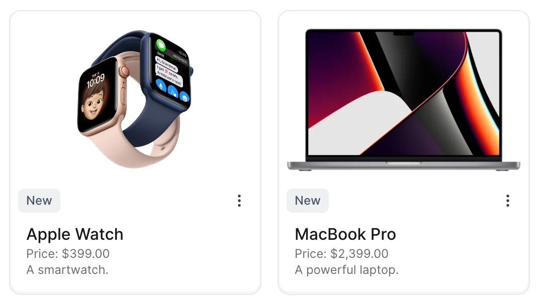
-> color
Sets the badge color. Accepts a static value or a proc for dynamic coloring based on the record.
Available colors
Base colors: red, orange, amber, yellow, lime, green, emerald, teal, cyan, sky, blue, indigo, violet, purple, fuchsia, pink, rose
Semantic colors: neutral, success, danger, warning, info
self.grid_view = {
  card: -> do
    {
      badge: {
        label: "New",
        color: "green"
      }
    }
  end
}
-> style
Controls the badge appearance style.
Available styles
subtle- Light background with colored text (default)solid- Solid colored background with white text
self.grid_view = {
  card: -> do
    {
      badge: {
        label: "New",
        color: "green",
        style: "solid"
      }
    }
  end
}
-> title
The tooltip text that appears when users hover over the badge. Useful for providing additional context or detailed information.
self.grid_view = {
  card: -> do
    {
      badge: {
        label: "New",
        title: "New product available"
      }
    }
  end
}
-> icon
Adds an icon to the badge.
self.grid_view = {
  card: -> do
    {
      badge: {
        label: "New",
        color: "green",
        icon: "tabler/outline/trending-up"
      }
    }
  end
}