Menu editor
One common task you need to do is organize your sidebar resources into menus. You can easily do that using the menu editor in the initializer.
When you start with Avo, you'll get an auto-generated sidebar by default. That sidebar will contain all your resources, dashboards, and custom tools. To customize that menu, you have to add the main_menu key to your initializer.
# config/initializers/avo.rb
Avo.configure do |config|
config.main_menu = -> {
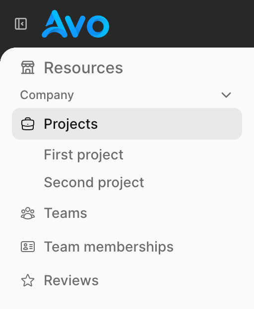
section "Resources", icon: "tabler/outline/building-store", collapsable: false do
group "Company", collapsable: true do
resource :projects do
link "First project", active: :inclusive, path: "/admin/resources/projects/1"
link "Second project", active: :inclusive, path: "/admin/resources/projects/2"
end
resource :team, icon: "heroicons/outline/user-group"
resource :team_membership
resource :reviews, icon: "heroicons/outline/star"
end
end
For now, Avo supports editing only two menus, main_menu and profile_menu. However, that might change in the future by allowing you to write custom menus for other parts of your app.
Menu item types
A few menu item types are supported: link_to, section, group, resource, dashboard, page, and action. There are a few helpers too, like all_resources, all_dashboards, all_pages, and all_tools.
The recommended hierarchy is section → group → resource → subitem. Sections are the top-level containers rendered with an icon header in the sidebar.
-> link_to
link_to is the menu item that the user will probably interact with the most. It will generate a link on your menu. You can specify the name, path , and target.
link_to "Google", path: "https://google.com", target: :_blankWhen you add the target: :_blank option, a tiny external link icon will be displayed.
link_to options
path
This is the path of the item. It may be ommited to make the API look like Rail's
config.main_menu = -> {
  # These two are equivalent
  link_to "Home", path: main_app.root_path
  link_to "Home", main_app.root_path
}
data
You may add arbitraty data attributes to your link.
You can make a link execute a put, post, or delete request similar to how you use the data-turbo-method attribute.
config.main_menu = -> {
  link_to "Sign out!", main_app.destroy_user_session_path, data: { turbo_method: :delete }
}
-> render
The render method will render renderable objects like partials or View Components.
You can even pass locals to partials. The partials follow the same pattern as the regular render method.
render "avo/sidebar/items/custom_tool"
render "avo/sidebar/items/custom_tool", locals: { something: :here }
render Super::Dooper::Component.new(something: :here)
-> resource
To make it a bit easier, you can use resource to quickly generate a link to one of your resources. For example, you can pass a short symbol name :user or the full name Avo::Resources::User.
resource :posts
resource "Avo::Resources::Comments"
You can also change the label for the resource items to something else.
resource :posts, label: "News posts"Additionally, you can pass the params option to the resource items to add query params to the link.
resource :posts, params: { status: "published" }
resource :users, params: -> do
  decoded_filter = {"Avo::Filters::IsAdmin"=>["non_admins"]}

  { encoded_filters: Avo::Filters::BaseFilter.encode_filters(decoded_filter)}
end
Subitems
You can nest items beneath a resource by passing a block. They appear as child items under the resource link in the sidebar.
Sub-items can be any menu item type:
A nested resource, dashboard, page, board, or action resolves its own URL automatically, so only link_to needs an explicit path:. A nested action also inherits its enclosing resource, so you don't repeat it.
# config/initializers/avo.rb
Avo.configure do |config|
  config.main_menu = -> {
    resource :projects do
      link_to "First project", path: "/admin/resources/projects/1"
      resource :tasks                 # nested resource
      dashboard :sales                # nested dashboard
      page "Avo::Pages::Settings"     # nested page
      board 1                         # nested kanban board
      action Avo::Actions::ExportData # nested action (inherits :projects)
    end
  }
end
The active option controls when the sub-link is highlighted as active:
:inclusive— the link is active when the current path starts with the givenpath(useful for nested routes):exclusive— the link is active only on an exact path match (default)
Sub-items don't render an icon. For readability you can optionally wrap them in a subitems block — it behaves identically to listing them directly.
-> dashboard
Similar to resource, this is a helper to make it easier to reference a dashboard. You pass in the id or the name of the dashboard.
dashboard :dashy
dashboard "Sales"
You can also change the label for the dashboard items to something else.
dashboard :dashy, label: "Dashy Dashboard"-> page
Similar to resource and dashboard, page adds a link to one of your pages. Pass the page's class name as a String:
page "Avo::Pages::Settings"
page "Avo::Pages::SystemHealth"
Use the String form
Reference the page by its class name in quotes, not the bare constant. The String is resolved when the menu renders, so the page class isn't autoloaded while your initializer is parsed — which is what prevents boot and reload errors. The bare constant still works, but the String form is recommended.
The label defaults to the page's navigation_label (falling back to its title). You can override it:
page "Avo::Pages::Settings", label: "App configuration"Like other menu items, page accepts the icon, hotkey, data, and visible options.
page "Avo::Pages::Settings", icon: "tabler/outline/adjustments", hotkey: "g s"INFO
Pages are provided by the avo-forms addon. The page and all_pages helpers are only available when it is installed.
-> action
action adds a menu item that triggers one of your actions. Clicking it opens the action's modal, just like the per-resource Actions dropdown.
# app/avo/actions/export_data.rb
class Avo::Actions::ExportData < Avo::BaseAction
  self.name = "Export data"
  self.standalone = true # required to add it to the menu

  def handle(fields:, **)
    # ...generate and return the export
  end
end# config/initializers/avo.rb
Avo.configure do |config|
config.main_menu = -> {
action Avo::Actions::ExportData, resource: :projects
}
endBecause the menu has no selected record, only standalone actions (self.standalone = true) can be added — actions that depend on selected records would run against nothing and are skipped (with a log warning).
resource
An action always lives under a resource's URL, so you must tell it which one. At the top level resource: is required; nested inside a resource block it is inherited from the enclosing resource (an explicit resource: still overrides it).
# config/initializers/avo.rb
Avo.configure do |config|
  config.main_menu = -> {
    # Top level — resource: required
    action Avo::Actions::ExportData, resource: :projects

    # Nested — inherits :projects automatically
    resource :projects do
      action Avo::Actions::ExportData
    end
  }
end
The label defaults to the action's self.name. Like other menu items, action accepts the label, icon, data, and visible options.
# app/avo/actions/export_data.rb
class Avo::Actions::ExportData < Avo::BaseAction
  self.name = "Export data" # used as the menu label unless you override it
  self.standalone = true
end# config/initializers/avo.rb
Avo.configure do |config|
config.main_menu = -> {
# `label` overrides "Export data"; `icon` is shown next to it
action Avo::Actions::ExportData, resource: :projects, label: "Export", icon: "tabler/outline/download"
}
end-> section
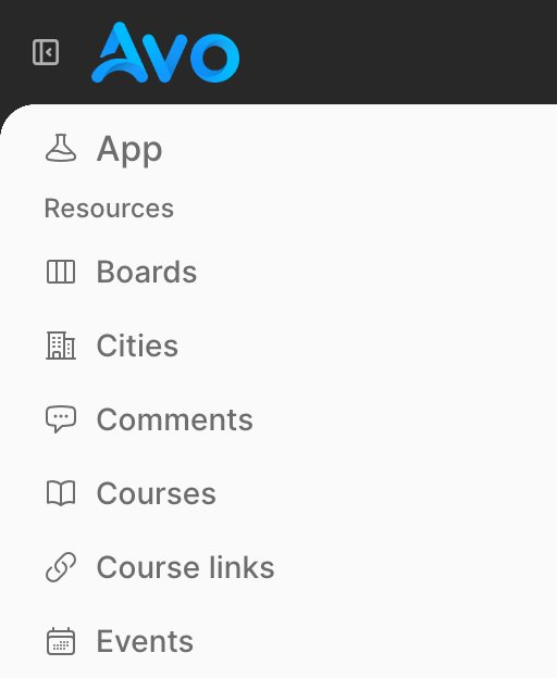
Sections are the top-level containers in the sidebar. They are rendered with a prominent header that includes an icon and a name. Sections are intended to group related groups and items at the highest level of the menu.
section "Resources", icon: "heroicons/outline/academic-cap" do
  group "Academia", collapsable: true do
    resource :course
    resource :course_link
  end

  group "Blog", collapsable: true, collapsed: true do
    resource :posts
    resource :comments
  end
end
You can also place items directly inside a section without a group:
section "Tools", icon: "heroicons/outline/finger-print" do
  all_tools
end
-> group
Groups are sub-categories nested inside sections. They render as a collapsable label and are used to cluster related items within a section. Groups support collapsable and collapsed options. Note that groups do not support the icon option.
section "Resources", icon: "heroicons/outline/academic-cap" do
  group "Blog", collapsable: true, collapsed: true do
    resource :posts
    resource :categories
    resource :comments
  end
end
Groups can also be placed at the top level without a parent section, but the recommended structure is to nest them inside sections.
-> all_resources
Renders all resources, except those explicitly excluded.
Arguments:
except: (Array, optional) – A list of resource names to be excluded.
Example:
section "App", icon: "heroicons/outline/beaker" do
  group "Resources" do
    all_resources except: [:users, :orders]
  end
end
In the example above, all resources will be rendered except Avo::Resources::Users and Avo::Resources::Orders.
-> all_dashboards
Renders all dashboards, except those explicitly excluded.
Arguments:
except: (Array, optional) – A list of dashboard names to be excluded.
Example:
section "App", icon: "heroicons/outline/beaker" do
  group "Dashboards" do
    all_dashboards except: [:sales, :analytics]
  end
end
In this example, all dashboards will be rendered except Avo::Resources::Sales and Avo::Resources::Analytics.
-> all_pages
Renders all your main pages.
Example:
section "Configuration", icon: "tabler/outline/settings" do
  all_pages
end
Only main pages are added to the menu — sub-pages are reached through their parent page's own navigation.
-> all_tools
Renders all tools.
section "App", icon: "heroicons/outline/beaker" do
  group "All tools" do
    all_tools
  end
end
all_ helpers
section "App", icon: "heroicons/outline/beaker" do
  group "Dashboards" do
    all_dashboards
  end

  group "Resources" do
    all_resources
  end

  group "All tools" do
    all_tools
  end
end
WARNING
The all_resources helper is taking into account your authorization rules, so make sure you have def index? enabled in your resource policy.
Item visibility
The visible option is available on all menu items. It can be a boolean or a block that has access to a few things:
- the
current_user. Given that you set a way for Avo to know who the current user is, that will be available in that block call - the
contextobject. - the
paramsobject of that current request - the
view_contextobject. Theview_contextobject lets you use the route helpers. eg:view_context.main_app.posts_path.
# config/initializers/avo.rb
Avo.configure do |config|
  config.main_menu = -> {
    resource :user, visible: -> do
      context[:something] == :something_else
    end
  }
end
Add data attributes to items
You may want to add special data attributes to some items and you can do that using the data option. For example you may add data: {turbo: false} to make a regular request for a link.
# config/initializers/avo.rb
Avo.configure do |config|
  config.main_menu = -> {
    resource :user, data: {turbo: false}
  }
end
Using authorization rules
When you switch from a generated menu to a custom one, you might want to keep using the same authorization rules as before. To quickly do that, use the authorize method in the visible option.
# config/initializers/avo.rb
Avo.configure do |config|
  config.main_menu = -> {
    resource :team, visible: -> do
      # authorize current_user, MODEL_THAT_NEEDS_TO_BE_AUTHORIZED, METHOD_THAT_NEEDS_TO_BE_AUTHORIZED
      authorize current_user, Team, "index?", raise_exception: false
    end
  }
end
Icons
The icon option is supported on section and on individual menu items (link_to, resource, dashboard, page). It is not supported on group or subitems (including links within subitems).
You can use icons from Heroicons (both outline and solid variants) or from Tabler Icons (preferred in Avo 4).
section "Resources", icon: "heroicons/solid/academic-cap" do
  group "Blog" do
    resource :posts, icon: "heroicons/outline/academic-cap"
  end
end

section "Resources", icon: "heroicons/solid/finger-print" do
  resource :course, icon: "heroicons/outline/finger-print"
end

section "Resources", icon: "heroicons/solid/adjustments" do
  resource :course, icon: "heroicons/outline/adjustments"
end
Icons on resource, dashboard, and link_to
In addition to sections, you can add icons to resource, dashboard, and link_to items.
link_to "Avo", "https://avohq.io", icon: "globe"Keyboard shortcuts on menu items
Any menu item — resource, link, or dashboard — accepts a hotkey: option. When set, Avo renders a <kbd> badge next to the label and registers the key binding so users can jump straight to that item from anywhere in the admin panel.
Avo.configure do |config|
  config.main_menu = -> {
    section "Content", icon: "tabler/outline/files" do
      resource :post, hotkey: "g p"
      resource :category, hotkey: "g c"
      link "Analytics", path: "/avo/analytics", hotkey: "g a"
    end
  }
end
The hotkey string follows @github/hotkey syntax. Use space-separated keys for sequences (e.g. "g p" means press g then p).
For resource items you can also set the hotkey on the resource class itself, which acts as a fallback when no hotkey: is passed to the menu item:
class Avo::Resources::Post < Avo::BaseResource
  self.hotkey = "g p"
endCollapsable sections and groups
Both section and group support the collapsable option. When enabled, an arrow icon is added to indicate the item can be collapsed. The collapsed/expanded state is stored in the browser's Local Storage and remembered across page loads.
section "Resources", icon: "heroicons/outline/academic-cap", collapsable: true do
  group "Blog", collapsable: true do
    resource :posts
    resource :comments
  end
end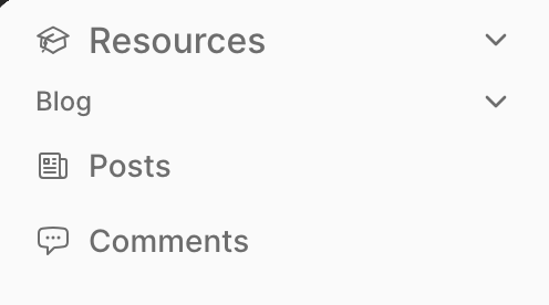
Default collapsed state
You can set a default collapsed state using the collapsed option. This only takes effect the first time a user visits — once they have a stored preference, that preference takes priority.
section "Resources", icon: "heroicons/outline/academic-cap", collapsable: true, collapsed: true do
  group "Blog", collapsable: true, collapsed: true do
    resource :posts
    resource :comments
  end
end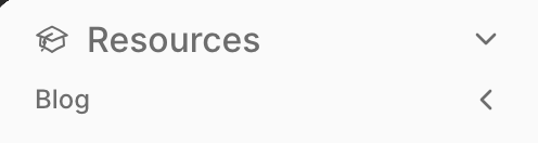
You might want to allow your users to hide certain items from view.
Authorization
Watch the demo videoIf you use the authorization feature, you will need an easy way to authorize your items in the menu builder. For that scenario, we added the authorize helper.
Avo.configure do |config|
  config.main_menu = -> {
    resource :team, visible: -> {
      # authorize current_user, THE_RESOURCE_MODEL, THE_POLICY_METHOD, raise_exception: false
      authorize current_user, Team, "index?", raise_exception: false
    }
  }
end
Use it in the visible block by giving it the current_user (which is available in that block), the class of the resource, the method that you'd like to authorize for (default is index?), and tell it not to throw an exception.
Now, the item visibility will use the index? method from the TeamPolicy class.
Profile menu
The profile menu allows you to add items to the menu displayed in the profile component. The sign-out link is automatically added for you.
You may add the icon option to the profile_menu links.
# config/initializers/avo.rb
Avo.configure do |config|
  config.profile_menu = -> {
    link_to "Profile", path: "/profile", icon: "user-circle"
  }
end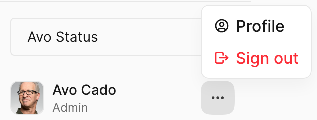
Forms in profile menu
It's common to have forms that POST to a path to do sign ut a user. For this scenario we added the method and params option to the profile item link_to, so if you have a custom sign out path you can do things like this.
# config/initializers/avo.rb
Avo.configure do |config|
  config.profile_menu = -> {
    link_to "Sign out", path: main_app.destroy_user_session_path, icon: "user-circle", method: :post, params: {custom_param: :here}
  }
end
Custom content in the profile menu
You might, however, want to add a very custom form or more items to the profile menu. For that we prepared the _profile_menu_extra.html.erb partial for you.
bin/rails generate avo:eject --partial :profile_menu_extraThis will eject the partial and you can add whatever custom content you might need.
<%# Example link below %>
<%#= render Avo::ProfileItemComponent.new label: 'Profile', path: '/profile', icon: 'user-circle' %>