Table View
The table view is the default way to display resources in Avo. It provides a powerful, tabular layout that supports searching, sorting, filtering, and pagination out of the box.
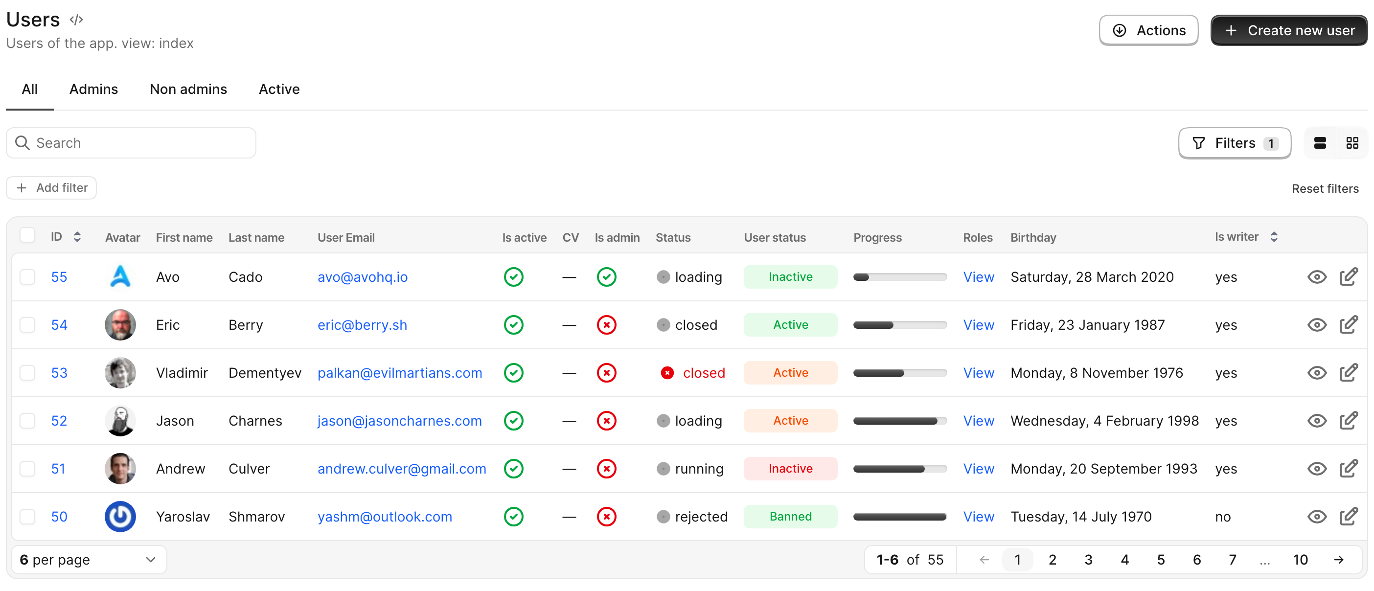
Row controls configuration
By default, resource controls are positioned on the right side of record rows. However, if the table contains many columns, these controls may become obscured. In such cases, you may prefer to move the controls to the left side for better visibility.
Avo provides configuration options that allow you to customize row controls placement, floating behavior, and visibility on hover either globally or individually for each resource.
Global configuration
resource_row_controls_config defines the default settings for row controls across all resources. These global configurations will apply to each resource unless explicitly overridden.
This option can be configured on config/initializers/avo.rb and defaults to the following:
# config/initializers/avo.rb
Avo.configure do |config|
  config.resource_row_controls_config = {
    placement: :right,
    float: false,
    show_on_hover: false
  }
end
Resource configuration
row_controls_config allows you to customize the row controls for a specific resource, overriding the global configuration.
This option can be configured individually for each resource and defaults to the global configuration value defined in resource_row_controls_config.
# app/avo/resources/user.rb
class Avo::Resources::User < Avo::BaseResource
  self.row_controls_config = {
    placement: :right,
    float: false,
    show_on_hover: false,
  }
end
-> placement
Defines the position of the row controls.
Optional
true
Default value
:right
Possible values
:left- Places the controls on the left side of the resource row.:right- Places the controls on the right side of the resource row.:both- Displays controls on both sides of the resource row.
WARNING
The float and show_on_hover options are designed to function optimally when placement is set to :right. While Avo does not restrict its usage with :left or :both, the applied styles are specifically intended for use with :right, and unexpected behavior may occur with other placements.
-> float
Determines whether the row controls should float over the row.
Watch the demo videoOptional
true
Default value
false
Possible values
true- Enables floating behavior.false- Disables floating behavior (default).
-> show_on_hover
Controls whether the row controls should be displayed only on hover.
Optional
true
Default value
false
Possible values
true- Displays the controls on hover only.false- Always shows the controls (default).
Row options
self.table_view = { row_options: { ... } } lets you declaratively set HTML attributes on the <tr> element for each record on the index, with optional per-record blocks. Use it to highlight rows, add custom data attributes, set tooltips, or attach Stimulus controllers — all without overriding the row component.
# app/avo/resources/message.rb
class Avo::Resources::Message < Avo::BaseResource
  self.table_view = {
    row_options: {
      class: -> { record.role == "agent" ? "bg-blue-50 dark:bg-blue-950/40" : "" },
      data: { test_id: "message-row" },
      title: -> { "Message from #{record.role}" }
    }
  }
end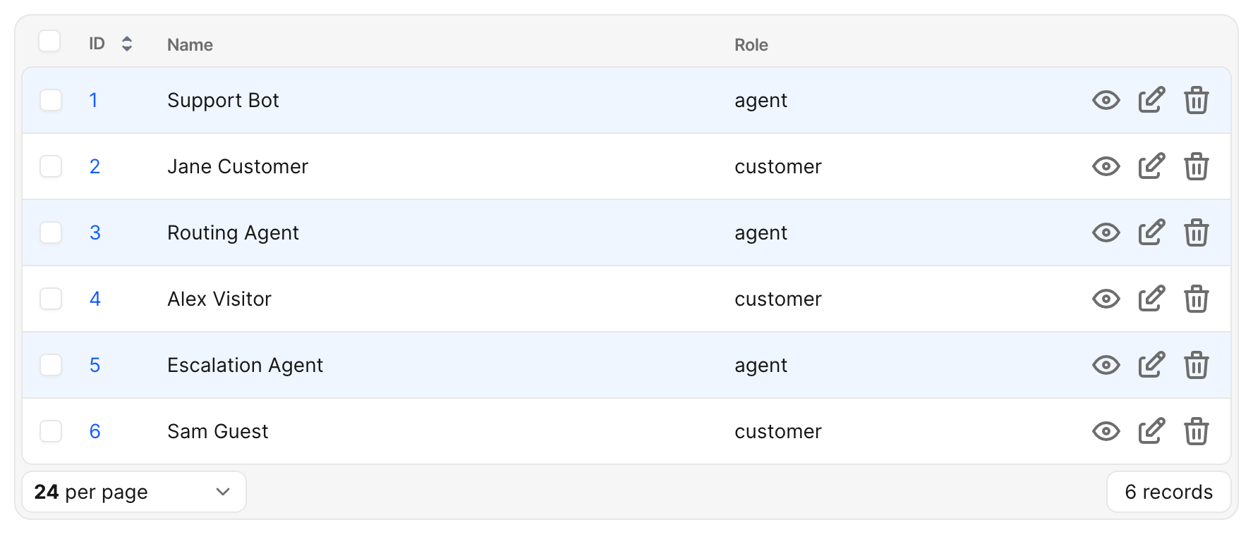
The same configuration applies to both the main index and any has_many association table that lists this resource.
Configuration shape
row_options accepts a hash whose values may be static or blocks. The whole hash itself can also be a block returning a hash.
# Per-value blocks (most common)
self.table_view = {
  row_options: {
    class: -> { record.archived? ? "opacity-60" : "" },
    data: { kind: "message" }
  }
}

# Top-level block (one evaluation context for many keys)
self.table_view = {
  row_options: -> {
    {
      class: record.archived? ? "opacity-60" : "",
      data: { kind: "message", archived: record.archived? }
    }
  }
}
Blocks are evaluated once per row, per render, through Avo::ExecutionContext. Inside a block you have access to:
record— the row's record instanceresource— the Avo resource instanceview—:indexon the main index,:has_manyinside an association panel- Standard
Avo::ExecutionContextdefaults (current_user,params,request, view helpers)
Supported keys
-> class
Tailwind classes (or any CSS class string) appended to Avo's row classes. Accepts String, Array<String>, or Hash<String, Boolean> like Rails' class_names helper.
class: "bg-yellow-50"                                  # String
class: -> { record.flagged? ? ["ring-2", "ring-red-300"] : [] }  # Array
class: -> { { "opacity-60" => record.archived? } }     # Hash
User classes are appended after Avo's, so they win at equal CSS specificity. Avo will not strip its own utility classes (notably cursor-pointer when click-to-view is enabled).
-> data
A hash of data-* attributes. User-provided data is deep-merged with Avo's existing data attributes:
data-controlleranddata-actionare token-concatenated (your Stimulus identifiers are added alongside Avo's, never replacing them)- Avo's reserved keys (
record_id,index,component_name,resource_name,resource_id,visit_path,reorder_target) are protected — attempts to set these are ignored with a development warning - Other keys pass through untouched
data: -> { { test_id: "message-#{record.id}", controller: "highlightable" } }-> style
Inline CSS style string. Pass-through to <tr>, HTML-escaped by Rails.
style: -> { "border-left: 4px solid #{record.priority_color};" }-> title, aria-label, other HTML attributes
Any other HTML attribute is passed through unchanged. Values are HTML-escaped by Rails' content_tag.
title: -> { "Created #{time_ago_in_words(record.created_at)} ago" }
"aria-label": -> { "Message from #{record.role}" }
Examples
Highlight by record state
class Avo::Resources::Order < Avo::BaseResource
  self.table_view = {
    row_options: {
      class: -> {
        case record.status
        when "failed"   then "bg-red-50 dark:bg-red-950/30"
        when "pending"  then "bg-amber-50 dark:bg-amber-950/30"
        when "shipped"  then "bg-emerald-50 dark:bg-emerald-950/30"
        else ""
        end
      }
    }
  }
end
Dim soft-deleted rows
self.table_view = {
  row_options: {
    class: -> { "opacity-60 italic" if record.discarded? }
  }
}
Branch on render context
The view local lets you apply different styling on the main index versus inside an association panel:
self.table_view = {
  row_options: {
    class: -> {
      next "" if view == :has_many        # quieter inside parent show pages
      record.urgent? ? "bg-amber-50 dark:bg-amber-950/30" : ""
    }
  }
}
Conditional return values
Returning nil or false from a block omits the attribute (or, for class:, leaves Avo's classes untouched). This makes ternaries and if modifiers natural:
class: -> { record.archived? ? "opacity-60" : nil }
data:  -> { record.special? ? { status: "active" } : nil }
title: -> { record.note.presence }
Hover and selection co-existence
Avo's row hover and selection styles use Tailwind utilities applied to <tr> (e.g., hover:bg-gray-50). When you set a custom background, you may want hover and selected affordances to remain visible:
- Use semitransparent backgrounds (
bg-blue-50/60,bg-amber-100/40) so Avo's hover overlay still shows through. - Or pair your custom class with explicit
hover:and selection variants:bg-blue-50 hover:bg-blue-100 dark:bg-blue-950/40 dark:hover:bg-blue-900/40.
Dark mode
User-supplied classes are outside Avo's semantic CSS variable system, so dark-mode handling is your responsibility. Two recommended patterns:
- Tailwind
dark:modifiers for utility classes:rubyclass: "bg-blue-50 dark:bg-blue-950/40" - Avo's semantic variables via inline
style:for theme-aware values:rubystyle: "background-color: var(--color-secondary);"
Tailwind safelist
Tailwind's JIT compiler only generates classes it sees in your source. If your class: block returns dynamic strings that aren't literally written elsewhere, add them to your tailwind.config.js:
// config/tailwind.config.js
module.exports = {
  content: [
    "./app/**/*.{rb,erb,html,js}",
    "./app/avo/**/*.rb",
  ],
  safelist: [
    "bg-red-50", "bg-amber-50", "bg-emerald-50",
    "dark:bg-red-950/30", "dark:bg-amber-950/30", "dark:bg-emerald-950/30",
    // Or use a regex pattern for whole color scales:
    { pattern: /bg-(red|amber|emerald)-(50|100)/, variants: ["dark"] },
  ],
}
Without this, classes returned only from row_options blocks will be purged from the production CSS bundle.
Reserved and denied keys
Some attributes are off-limits because Avo owns them or they break behavior:
| Attribute | Reason |
|---|---|
id | Avo emits <tr id="..."> for tests and Stimulus targeting |
role | The implicit role="row" on <tr> inside <table> is canonical; overriding breaks screen-reader semantics |
aria-selected | Owned by Avo's row-selection state |
on* event handlers (onclick, onmouseover, …) | Use Stimulus actions via data: { action: "..." } instead |
tabindex, contenteditable, draggable | Conflict with Avo's keyboard navigation and selection |
In development and test, setting any of these raises ArgumentError listing the supported keys. In production, the row falls back to Avo's defaults and the violation is logged via Avo.logger.
Performance
Blocks run once per row, per render, after Avo's row cache boundary. For tables with many rows or large per_page values:
- Preload associations referenced from blocks via
self.includes. A naïverecord.user.role.nameis an N+1 across every row. - Keep blocks cheap — they run on every render, not just initial page load.
self.includes = [:role]
self.table_view = {
  row_options: {
    class: -> { "role-#{record.role.slug}" }   # `role` is preloaded
  }
}
Migration from row component overrides
If you previously overrode Avo::Index::TableRowComponent to add a class or data attribute per row, you can usually replace the override with row_options and remove the custom component. The new API runs in Avo's stock render path, so resources without self.table_view configured behave exactly as they did before.
If your override does anything beyond <tr> attribute customization (e.g., changes which cells render), keep the override — row_options only controls the <tr> itself.
Limitations
- No cell-level options yet. A future
cell_optionsAPI will let you customize individual<td>elements via the field DSL. For now,row_optionsonly affects the row container. - No grid or kanban analog.
self.grid_viewis the future home for grid-card options; kanban gets its own when the time comes. - Turbo Stream re-renders. When a row is broadcast-updated via Turbo Stream, the
view:local resolves based on the original render context. Verify in your specs if you depend onviewbranching.