Tabs
Once your Avo resources reach a certain level of complexity, you might feel the need to better organize the fields, associations, and resource tools into groups. You can already use the heading to separate the fields inside a panel, but maybe you'd like to do more.
Tabs are a new layer of abstraction over panels. They enable you to group panels and tools together under a single pavilion and toggle between them.
class Avo::Resources::User < Avo::BaseResource
  def fields
    field :id, as: :id, link_to_record: true
    field :email, as: :text, name: "User Email", required: true

    tabs do
      tab title: "User information", description: "Some information about this user" do
        panel do
          field :first_name, as: :text, required: true, placeholder: "John"
          field :last_name, as: :text, required: true, placeholder: "Doe"
          field :active, as: :boolean, name: "Is active", show_on: :show
        end
      end

      field :teams, as: :has_and_belongs_to_many
      field :people, as: :has_many
      field :spouses, as: :has_many
      field :projects, as: :has_and_belongs_to_many
    end
  end
end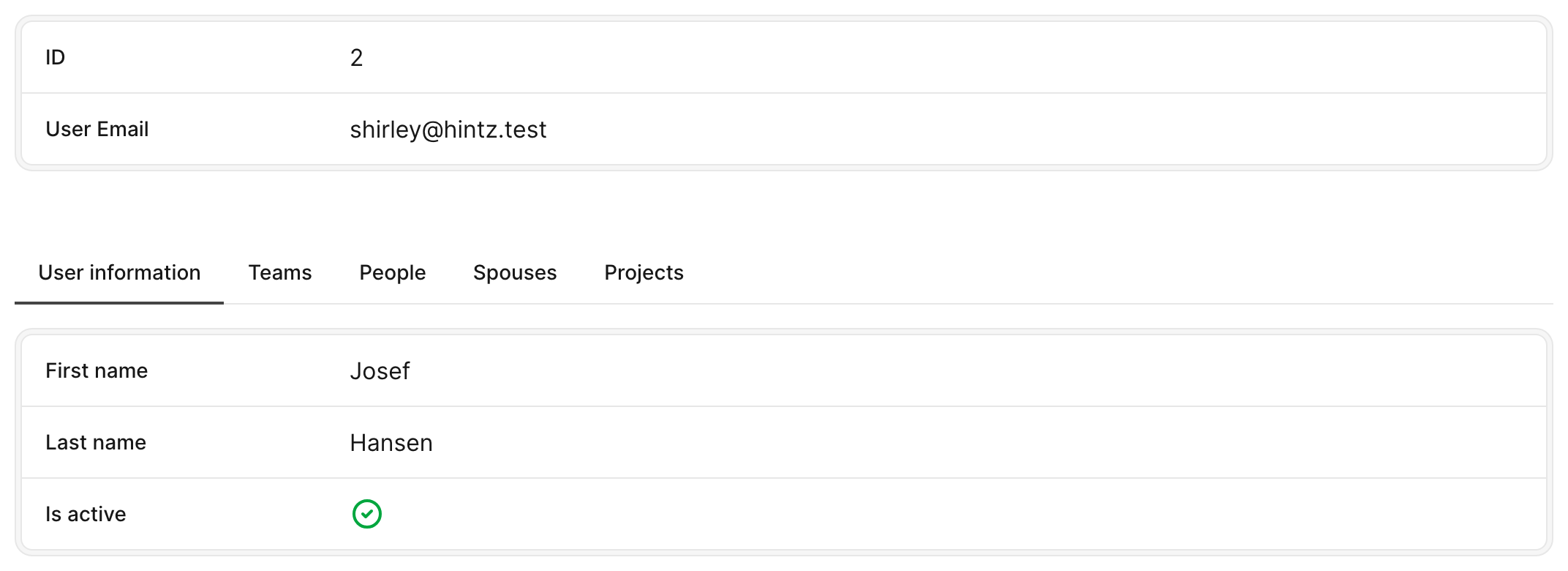
To use tabs, you need to open a tabs group block. Next, you add your tab block where you add fields and panels like you're used to on resource root. Most fields like text, number, gravatar, date, etc. need to be placed in a panel. However, the has_one, has_many, and has_and_belongs_to_many have their own panels, and they don't require a panel or a tab.
The tab title is mandatory and is what will be displayed on the tab switcher. The tab description is what will be displayed in the tooltip on hover.

Tabs on Show view
Tabs have more than an aesthetic function. They have a performance function too. On the Show page, if you have a lot of has_many type of fields or tools, they won't load right away, making it a bit more lightweight for your Rails app. Instead, they will lazy-load only when they are displayed.
Tabs on Edit view
All visibility rules still apply on Edit, meaning that has_* fields will be hidden by default. However, you can enable them by adding show_on: :edit. All other fields will be loaded and hidden on page load. This way, when you submit a form, if you have validation rules in place requiring a field that's in a hidden tab, it will be present on the page on submit-time.
Durable and "Bookmarkable"
Tabs remain durable within views, meaning that when switch between views, each tab group retains the selected tab. This ensures a consistent UX, allowing for seamless navigation without losing context.
Moreover, you have the ability to bookmark a link with a personalized tab selection.
This functionalities relies on the unique tab group ID. To take full advantage of this feature, it's important to assign a unique ID to each tab group defined in your application.
tabs id: :some_random_uniq_id do
  field :posts, as: :has_many, show_on: :edit
end
Display counter indicator on tabs switcher
Check this recipe on how to enhance your tabs switcher with a counter for each association tab.
Visibility control
Both tabs and individual tab components support a visible option that allows you to dynamically control their visibility based on certain conditions. For example, you might want to hide a tab if the user doesn't have the necessary permissions to view its content.
-> visible
The visible option allows you to control the visibility of either a group of tabs or an individual tab. It can be a boolean or a lambda.
Example
tabs visible: -> { resource.record.enabled? } do
  tab title: "General Information" do
    panel do
      field :name, as: :text
      field :email, as: :text
    end
  end
  tab title: "Admin Information", visible: -> { current_user.is_admin? } do
    panel do
      field :role, as: :text
      field :permissions, as: :text
    end
  end
end
In this example:
- The entire group of tabs is only visible if the record is enabled (
resource.record.enabled?). - Within this group, the "General Information" tab is always visible when the tabs are shown.
- The "Admin Information" tab is only visible for admin records (
resource.record.admin?).
-> title
The title option enables you to specify a label for the entire group of tabs. This title serves as an overarching descriptor for the collection, providing context regarding the purpose or content of the tabs.
You can define the title of a tabs group by passing it as an argument to the tabs block. The value should be a string that succinctly encapsulates the theme or purpose of the tabs.
tabs title: "Tabs group title" do
  # ...
end
-> description
The description option allows you to provide an auxiliary explanation or detailed note for the entire group of tabs. This can be used to elaborate on the purpose of the tabs or provide additional guidance.
You can define a description for a tabs group by passing it as an argument to the tabs block. The value should be a string that offers further clarity about the content or functionality of the tabs.
tabs description: "Tabs group description" do
  # ...
end
-> lazy_load
The lazy_load option enables deferred loading of tab content, improving performance by fetching data only when the tab is clicked. By default, lazy_load is set to false, ensuring that all tabs load immediately. However, in form views, this option is automatically disabled to prevent data loss during form submission.
tabs do
  tab title: "Address", lazy_load: true do
    # ...
  end
end
-> loading
While lazy_load fetches a tab's content automatically when the tab is revealed, loading: :manual defers the fetch until the user explicitly asks for it. The tab renders a placeholder with a Load button and fetches nothing until clicked — useful for heavy tabs you don't want to load on every page view.
tabs do
  tab title: "Orders", loading: :manual do
    field :orders, as: :has_many
  end
end
Each manual tab gets its own Load button (per-tab gating). On click, the real tab content replaces the placeholder. If the request fails, an inline error with a Retry button is shown inside the frame.
Possible values
| Value | Behavior |
|---|---|
:manual | Placeholder + Load button; fetches on click. Once opened, the tab is remembered for 15 minutes by default (see auto_load_for). |
{ mode: :manual } | Same as :manual. |
{ mode: :manual, auto_load_for: 5.minutes } | Manual with a custom sliding memory window — once opened, the tab auto-loads (no placeholder) on return visits for the given duration. |
{ mode: :manual, auto_load_for: 0 } | Manual with no memory — the placeholder returns on every visit (0 or nil opts out). |
:lazy / { mode: :lazy } | Native lazy loading (equivalent to lazy_load: true). |
Remembering an opened tab
Once the user opens a manual tab, Avo remembers it for 15 minutes by default and auto-loads it (no placeholder) on return visits. Pass auto_load_for to change the window, or auto_load_for: 0 (or nil) to opt out:
tab title: "Orders", loading: { mode: :manual, auto_load_for: 5.minutes } do
  field :orders, as: :has_many
end
A short-lived cookie scoped per record + tab remembers the opened tab and slides the window forward on each return visit. Once it lapses, the placeholder + Load button return.
INFO
loading: :manual is purely additive — omitting it leaves every tab behaving exactly as before. Like lazy_load, manual loading is a Show-view concern and does not apply to form views.