
Boolean
The Boolean field renders a input[type="checkbox"] on Form views and a nice green check icon/red X icon on the Show and Index views.
field :is_published,
  as: :boolean,
  name: 'Published',
  true_value: 'yes',
  false_value: 'no'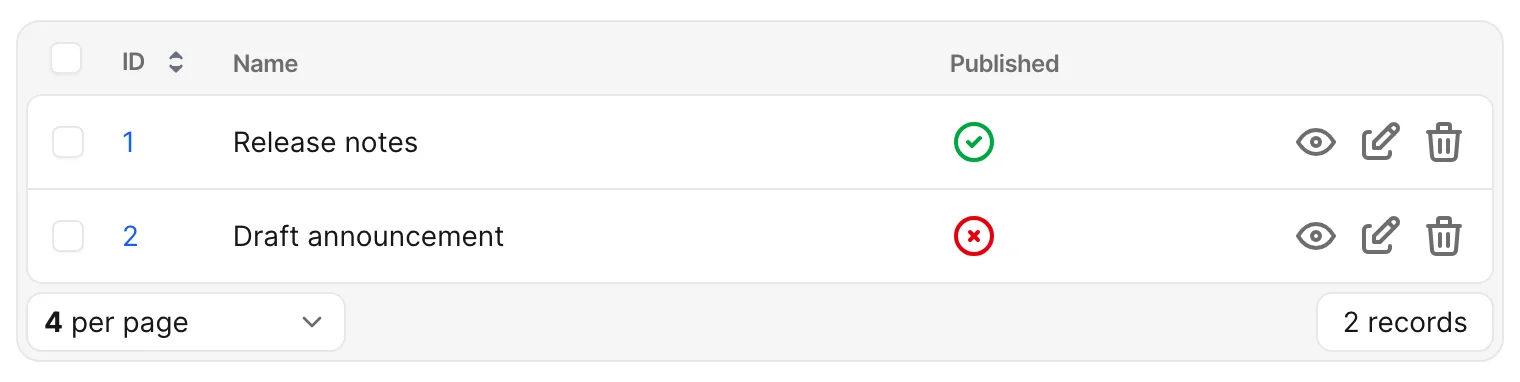
Options
-> true_value
An extra value that should count as true, on top of the ones Avo always recognizes. Use it when your column stores something like "yes" or 1.
Default value
true
Possible values
Any value (string, symbol, integer, etc.). The field always treats "true", "1", and the configured true_value as true.
field :is_published, as: :boolean, true_value: "yes"-> false_value
An extra value that should count as false, on top of the ones Avo always recognizes. Use it when your column stores something like "no" or 0.
Default value
false
Possible values
Any value (string, symbol, integer, etc.). The field always treats "false", "0", and the configured false_value as false.
field :is_published, as: :boolean, false_value: "no"-> nil_as_indeterminate
When true, nil values render as a gray minus-circle icon on Show and Index views instead of the default dash. This keeps the nil value intact while making it more visible.

Default value
false
Possible values
true or false
field :is_published, as: :boolean, nil_as_indeterminate: true