Avo::UI::PanelComponent
The panel is one of the most used building blocks in Avo. It renders a titled container with an optional description, header controls, body, sidebar, and footer.
<%= render Avo::UI::PanelComponent.new(title: @product.name, description: @product.description) do |panel| %>
  <% panel.with_controls do %>
    <%= a_link(@product.link, icon: "tabler/outline/eye", style: :primary, color: :primary) do %>
      View product
    <% end %>
  <% end %>

  <% panel.with_card do %>
    <div class="flex flex-col p-4 min-h-24 space-y-4">
      <h3>Product information</h3>

      <p>Style: shiny</p>
    </div>
  <% end %>
<% end %>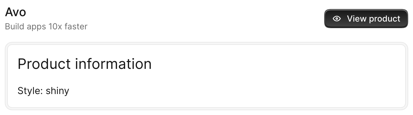
Options
All options are optional. You may render a panel without any of them.
<%= render Avo::UI::PanelComponent.new do |panel| %>
  <% panel.with_body do %>
    Something here.
  <% end %>
<% end %>
-> title
-> description
-> class
A list of CSS classes applied to the panel container.
Type
String
<%= render Avo::UI::PanelComponent.new(title: "Panel", class: "ring-2 ring-blue-500") do |panel| %>
  <% panel.with_body do %>
    Something here.
  <% end %>
<% end %>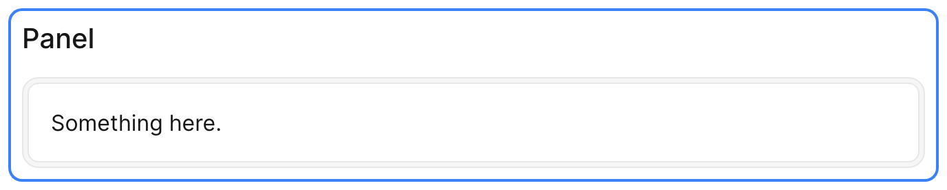
-> data
-> index
The item index, forwarded to the container as a data-item-index attribute. Used when panels are rendered as part of a collection (for example the Grid view).
Type
Integer
-> content_focusable
When true, the panel body becomes a keyboard focus anchor: focusing it lets the user Tab into the fields and Shift+Tab back to the header controls. Defaults to false.
Type
Boolean
Slots
The component exposes a few slots where you customize the content of specific areas.
-> header
Replaces the default header (title, description and controls) with your own markup. Use it when you need full control over the top of the panel.
<%= render Avo::UI::PanelComponent.new do |panel| %>
  <% panel.with_header do %>
    <%= render Avo::UI::PanelHeaderComponent.new(title: "Dashboard", description: "Everything at a glance") %>
  <% end %>
<% end %>
-> controls
A place for panel controls such as back, edit, delete, and detach buttons. The controls are automatically aligned to the right of the header and collapse under the title and description on narrow screens.
<%= render Avo::UI::PanelComponent.new(title: "Dashboard") do |panel| %>
  <% panel.with_controls do %>
    <%= a_link("/admin", icon: "tabler/outline/external-link", style: :primary, color: :primary) do %>
      Admin
    <% end %>
  <% end %>
<% end %>
-> cover
A full-width area rendered at the very top of the panel, above the header. Handy for a cover image or banner.
<%= render Avo::UI::PanelComponent.new(title: "Product") do |panel| %>
  <% panel.with_cover do %>
    <%= image_tag @product.cover_url, class: "w-full h-40 object-cover" %>
  <% end %>
<% end %>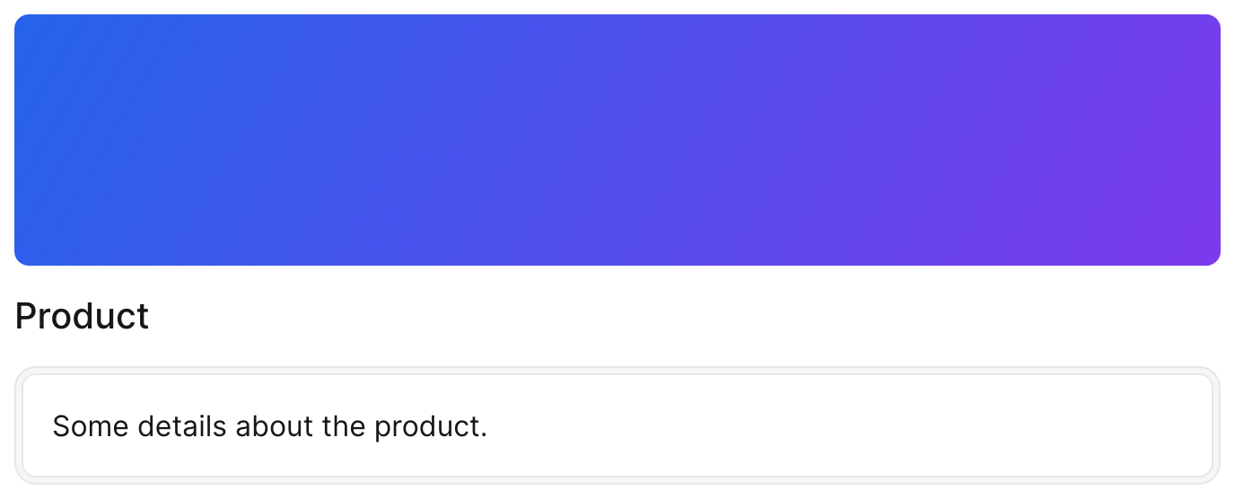
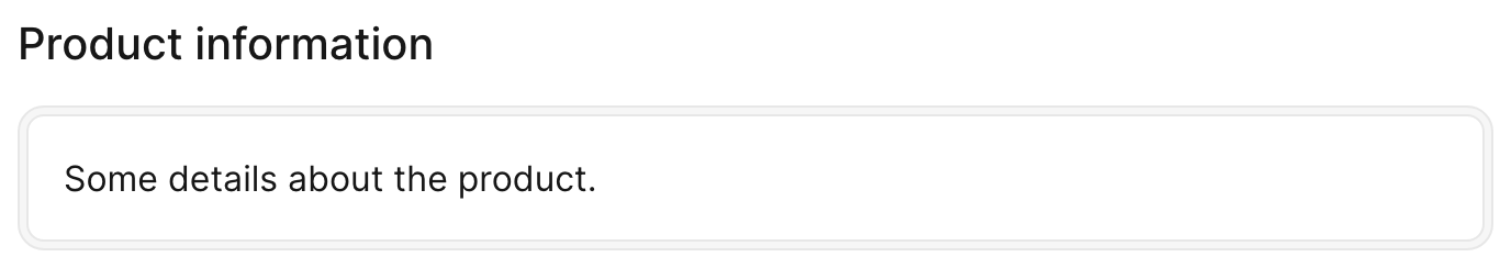
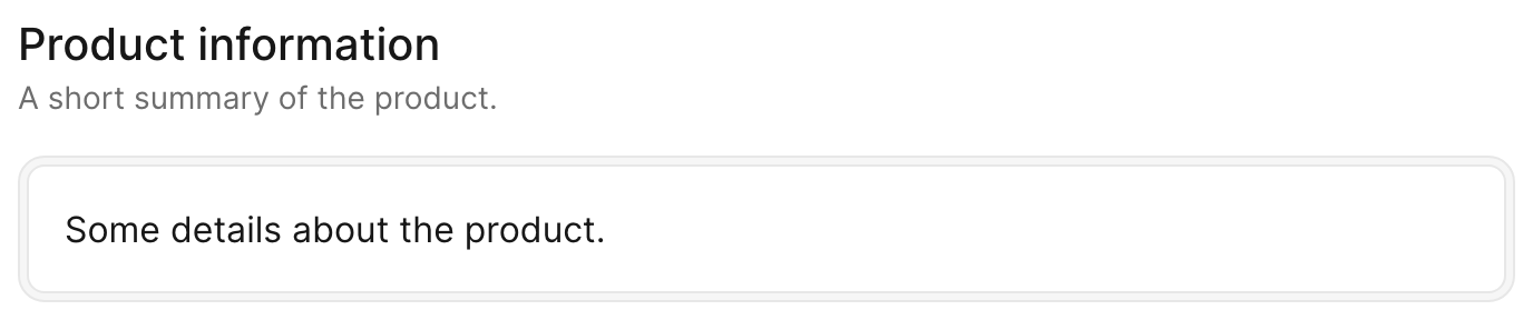
-> body
The main slot of the component, where the bulk of the content is displayed flush in the panel (no card wrapper).
<%= render Avo::UI::PanelComponent.new(title: "Product information") do |panel| %>
  <% panel.with_body do %>
    <p>This content is rendered flush in the panel body. There is no card wrapping it, so it sits directly on the panel surface — use this slot when your content already brings its own card.</p>
  <% end %>
<% end %>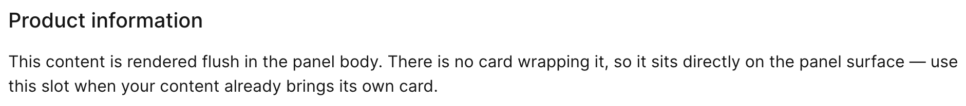
-> card
Wraps the content in a card automatically. Use this instead of body when you want the content to sit inside a bordered, padded card.
<%= render Avo::UI::PanelComponent.new do |panel| %>
  <% panel.with_card do %>
    Something here.
  <% end %>
<% end %>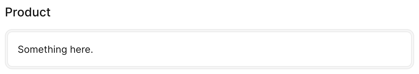
-> sidebar
Shows content in a smaller area on the end side of the body.
<%= render Avo::UI::PanelComponent.new(title: "Product") do |panel| %>
  <% panel.with_card do %>
    Main content here.
  <% end %>

  <% panel.with_sidebar do %>
    Something tiny here.
  <% end %>
<% end %>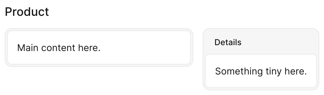
-> pre_bodies
Content rendered between the header and the body. Can be used more than once; each entry is rendered in order.
<%= render Avo::UI::PanelComponent.new(title: "Product") do |panel| %>
  <% panel.with_pre_body do %>
    A notice above the body.
  <% end %>

  <% panel.with_card do %>
    Main content here.
  <% end %>
<% end %>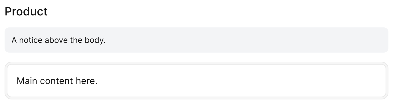
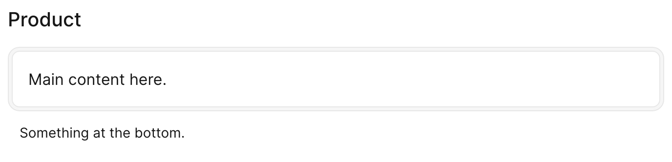
-> footer
The lowest area of the component, rendered under the body or card.
<%= render Avo::UI::PanelComponent.new(title: "Product") do |panel| %>
  <% panel.with_card do %>
    Main content here.
  <% end %>

  <% panel.with_footer do %>
    Something at the bottom.
  <% end %>
<% end %>