
Fields layout
Avo gives you a composable DSL to control how fields are arranged on resource show and edit pages. You nest fields inside panels, split a panel into a main area and a sidebar, group panels under tabs, and control where the resource header appears — all from the fields method.
# app/avo/resources/user.rb
class Avo::Resources::User < Avo::BaseResource
  def fields
    field :id,    as: :id
    field :name,  as: :text
    field :email, as: :text
  end
end
With no explicit structure, Avo wraps your root-level fields in a computed main panel and places a header at the top automatically — so a resource looks right before you touch any layout DSL.
Layout building blocks
| Block | Purpose | Nesting |
|---|---|---|
header | Title, description, profile photo, discreet information and controls | Root level |
panel | Groups related fields inside a titled container | Root level or inside tabs |
card | Lightweight grouping — useful for sectioning fields visually | Root, panel, sidebar or tab |
sidebar | Narrow column for compact fields (boolean, date, badge…) | Inside a panel |
tabs | Tabbed container that switches between panels and tools | Root level |
As a resource grows, declare the structure explicitly to get full control:
# app/avo/resources/user.rb
class Avo::Resources::User < Avo::BaseResource
  def fields
    tool Avo::ResourceTools::UserTool

    header # render the header only if you want to add a tool or card above it

    panel title: "User information", description: "Some information about this user" do
      field :id,         as: :id, link_to_record: true
      field :first_name, as: :text
      field :last_name # omitting the `as:` option renders the field as :text

      sidebar do # works only inside a panel
        card do
          field :active,     as: :boolean, only_on: :show
          field :created_at, as: :date_time, only_on: :show
        end
      end
    end

    tabs do
      tab title: "Projects" do
        field :projects, as: :has_many
      end

      field :teams, as: :has_many # some fields (associations) have their own wrappers and we don't need to wrap them in a tab

      tab title: "Settings" do
        field :role,     as: :select, enum: ::User.roles
        field :verified, as: :boolean
      end
    end
  end
end
Header
Every resource page gets a header for free: the band of chrome at the top holding the cover image, title, description, avatar, discreet info, and the control buttons (edit, save, delete, actions, back). If you never mention header, Avo builds one and pins it to the very top of the page — so you don't declare it unless you want it somewhere else.
Reach for the header DSL only when that default top placement is wrong — for example, to slip an intro card, resource tool, or panel above the header, or to sit the header between two panels. Declaring header yourself opts out of the automatic one, and it renders exactly where you place it in fields:
# app/avo/resources/user.rb
class Avo::Resources::User < Avo::BaseResource
  self.title = :name

  def fields
    card do
      field :status, as: :badge
    end

    header # the page header now renders below the card instead of at the top

    panel do
      field :id,    as: :id
      field :email, as: :text
    end
  end
end
header is a positioning marker, not a content hook: it takes no options, and everything it shows (title, description, cover, avatar, controls) comes from the resource itself. To customize what appears, set the resource's title, description, cover, and so on — not the header call.
INFO
Don't confuse header with heading. header is the page-level chrome positioned here; heading is a field type for inline section titles inside a panel or form. When a resource is embedded in a modal, the header is dropped from the edit view — its title and controls move into the modal's own chrome.
Group fields into panels
Panels are the backbone of Avo's display — most information on a page lives inside one. When you don't declare any panels, Avo groups root-level fields into computed panels for you; add your own panel blocks to group related fields under a title and description.
# app/avo/resources/user.rb
class Avo::Resources::User < Avo::BaseResource
  def fields
    field :id,    as: :id, link_to_record: true
    field :email, as: :text, name: "User Email", required: true

    panel title: "User information", description: "Some information about this user" do
      field :first_name, as: :text, required: true, placeholder: "John"
      field :last_name,  as: :text, required: true, placeholder: "Doe"
      field :active,     as: :boolean, name: "Is active", show_on: :show
    end
  end
end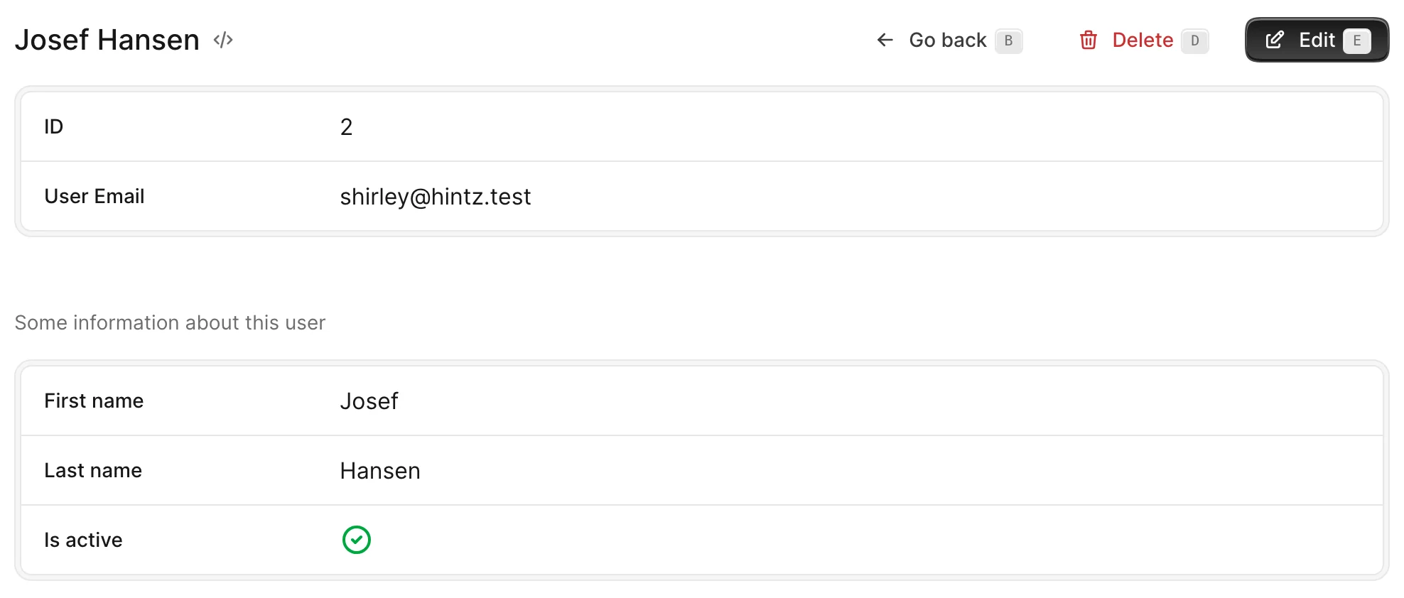
Set title and description to label a panel, and visible to show or hide a whole panel and its children at once. Use card blocks to section fields visually without opening a new panel.
How Avo computes panels
Avo organizes panels behind the scenes so you don't have to. As long as you haven't declared a panel of your own, it splits your fields into those that carry their own panel (most associations, like field :users, as: :has_many) and "standalone" fields, preserving declaration order, then wraps each standalone group in a computed panel. A single run of standalone fields becomes the main panel:
def fields
  field :id,   as: :id
  field :name, as: :text
  field :user, as: :belongs_to
  field :type, as: :text
end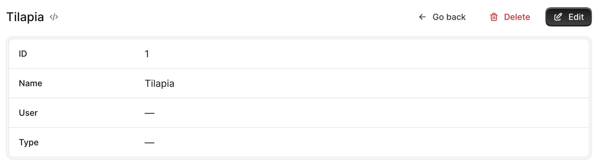
Insert a field that owns its panel (like a has_many) between standalone fields and Avo splits them: each standalone group — before and after the association — is wrapped in its own computed panel.
def fields
  field :id,   as: :id
  field :name, as: :text

  field :reviews, as: :has_many

  field :user, as: :belongs_to
  field :type, as: :text
end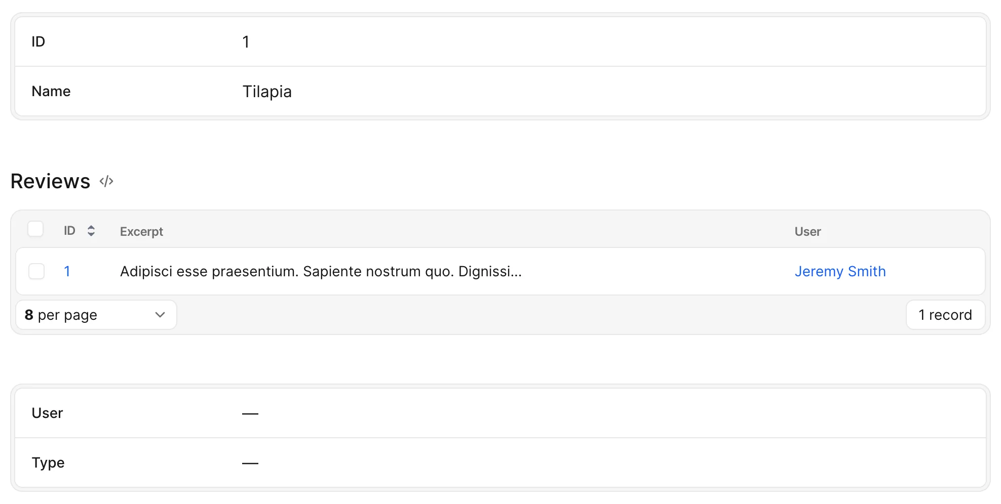
To group fields under your own titled container, add a panel block. Declaring a panel yourself turns the automatic computing off — Avo takes it as a sign you're in control of the layout.
Index view fields
The Index table builds its columns from root-level fields and from fields inside root-level panel and card blocks alike. Only sidebar contents and fields inside tabs stay off the table. To keep a panel's fields out of the Index view, hide the whole panel there with except_on: :index — or hide individual fields the same way.
class Avo::Resources::User < Avo::BaseResource
  def fields
    # Visible on Index
    field :id,    as: :id, link_to_record: true
    field :email, as: :text, name: "User Email", required: true
    field :name,  as: :text, only_on: :index do
      "#{record.first_name} #{record.last_name}"
    end

    # Hidden on Index
    panel title: "User information", except_on: :index do
      field :first_name, as: :text, required: true, placeholder: "John"
      field :last_name,  as: :text, required: true, placeholder: "Doe"
      field :active,     as: :boolean, name: "Is active", show_on: :show
    end
  end
end
Move compact fields to a sidebar
Some fields — booleans, dates, badges — don't need the full width of the main area. Put them in a sidebar block, declared inside a panel, to stack them in a narrower column beside the main content. Standalone fields are auto-wrapped in a card — declare a card yourself only to title the group — and each panel can have its own sidebar.
# app/avo/resources/user.rb
class Avo::Resources::User < Avo::BaseResource
  def fields
    panel do
      field :id,         as: :id, link_to_record: true
      field :first_name, as: :text, placeholder: "John"
      field :last_name,  as: :text, placeholder: "Doe"

      # Custom resource tools work here too
      tool UserTimeline

      sidebar do
        card do
          field :email,  as: :gravatar, link_to_record: true, only_on: :show
          field :active, as: :boolean, name: "Is active", only_on: :show
        end
      end
    end
  end
end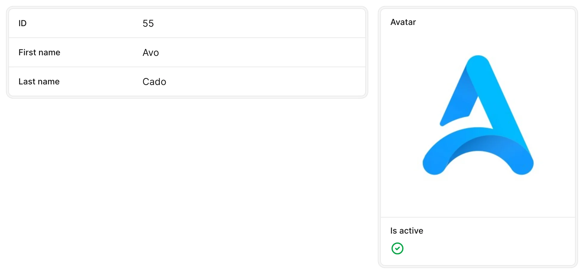
Sidebar fields are always stacked — label above value — because the narrower column requires it.
Organize fields under tabs
When a resource grows past what panels comfortably hold, group panels and tools under tabs. Open a tabs block, then add tab blocks that contain fields exactly as you would at the root. Standalone fields are auto-wrapped, so a panel or card inside a tab is optional — add one only when you want a title or description on that group. Association fields (has_one, has_many, has_and_belongs_to_many) bring their own panels.
# app/avo/resources/user.rb
class Avo::Resources::User < Avo::BaseResource
  def fields
    field :id,    as: :id, link_to_record: true
    field :email, as: :text, name: "User Email", required: true

    tabs do
      tab title: "User information", description: "Some information about this user" do
        # No panel needed — these fields are auto-wrapped
        field :first_name, as: :text, required: true, placeholder: "John"
        field :last_name,  as: :text, required: true, placeholder: "Doe"
        field :active,     as: :boolean, name: "Is active", show_on: :show
      end

      field :teams,    as: :has_and_belongs_to_many
      field :people,   as: :has_many
      field :projects, as: :has_and_belongs_to_many
    end
  end
end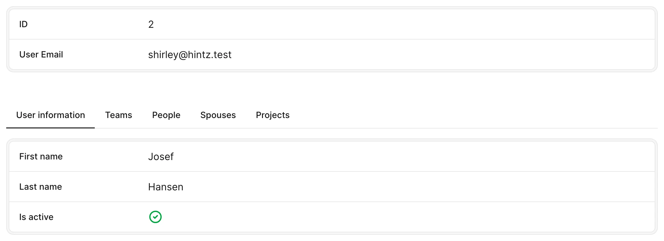
The tab title is mandatory and labels the switcher; the description shows as a tooltip on hover. Both tabs groups and individual tabs accept a visible boolean or lambda, and the whole group takes its own title and description. Add a badge to a tab — a string or a renderable like Avo::UI::CountComponent — to show a count or status pill next to its label. Tab and panel titles also localize through the resource's translation key.
Loading behavior on Show and Edit
On the Show page, has_many-type fields and tools inside tabs lazy-load only when their tab is displayed, keeping the initial page light. For heavy tabs you'd rather not fetch on every view, set loading: :manual to render a Load button and defer the fetch until the user asks for it. A tab's own content renders eagerly by default; set lazy_load to defer it until the tab is first revealed.
On Edit, has_* fields stay hidden by default (add show_on: :edit to reveal them); all other fields load and hide so form validations on fields in an inactive tab still fire on submit.
Durable and bookmarkable selection
Tab selection is durable across view changes — each tab group remembers its active tab — and bookmarkable, so a link can carry a specific tab. Both rely on a unique tab-group ID; without one Avo falls back to the group's title, then to its position, so assign an id to keep links stable as groups get renamed or reordered:
tabs id: :some_random_uniq_id do
  field :posts, as: :has_many, show_on: :edit
end
To add a record-count badge to association tabs, see the tabs counter indicator recipe.
Position labels: inline vs. stacked
Every field has two layout modes for how its label sits relative to its value. Inline (default) places them side by side; stacked puts the label above the value, giving it the full width — handy for wide fields like key_value, trix, code, or markdown.
field :meta, as: :key_value, stacked: trueFields inside a sidebar are stacked automatically. To stack every field across the app, set config.field_wrapper_layout = :stacked. See stacked in the field options reference and global stacked layout in the guide for the full details.
Multi-column rows with width
To place fields on the same row, pass a width percentage to each — adjacent fields below 100 sit side by side.
field :first_name, width: 50
field :last_name,  width: 50
Supported values are 25, 33, 50, 66, 75, and 100 (default). See width in field options for the full reference.