
Custom controls API
Per-control reference for custom controls. For task-oriented documentation and worked examples, see the Custom controls guide.
Controls are declared inside a block assigned to one of the four control areas on a resource:
class Avo::Resources::Fish < Avo::BaseResource
  self.show_controls = -> do
    back_button label: ""
    edit_button label: "Edit fish"
  end
end
The blocks are executed in a context that gives you access to record, resource, view, and params.
Control areas
-> show_controls
The controls rendered in the Show view header.
- Default:
back_button,delete_button,detach_button,actions_list,edit_button
-> edit_controls
The controls rendered in the Edit and New view headers. The same block runs on both views — check view to differentiate.
- Default:
back_button(labeled "Cancel"),delete_button,actions_list,save_button
-> index_controls
The controls rendered in the Index view header.
- Default:
attach_button,actions_list,create_button
-> row_controls
The controls rendered at the end of each table row on the Index view, and on grid view items.
- Default:
order_controls,show_button,edit_button,detach_button,delete_button
Controls
-> back_button
Links to a previous page. The link is not a history.back() action — it's computed based on the parameters sent by Avo, so the user has consistent hierarchical progress through the app.
-> edit_button
-> show_button
Links to the record's Show view. Rendered by default in the row controls.
-> save_button
-> create_button
Links to the resource's New view. Rendered by default in the index controls.
-> attach_button
Opens the attach modal. It's visible only when the resource is rendered as an association on another record's page.
-> delete_button
Adds the appropriate destroy form. It takes your authorization policy rules into account.
-> detach_button
Adds the appropriate detach form. It's visible only when the resource is rendered as an association on another record's page. It takes your authorization policy rules into account.
-> order_controls
Renders the reordering controls configured through the record reordering feature. Rendered by default in the row controls.
-> actions_list
A dropdown where the user can see and run all the actions assigned to that resource.
actions_list label: "Runnables", style: :primary, color: :slate- Options:
label,title,style,color,icon,include,exclude - Default style:
:outline - Default icon:
tabler/outline/circle-arrow-down
exclude
Filters out the specified actions. It's used in conjunction with the action control — when you extract an action into its own button, use exclude so it isn't also displayed in the dropdown.
actions_list exclude: Avo::Actions::DisableAccount
# Or
actions_list exclude: [Avo::Actions::ExportSelection, Avo::Actions::PublishPost]
include
Displays only the specified actions in the dropdown.
actions_list include: Avo::Actions::DisableAccount
# Or
actions_list include: [Avo::Actions::ExportSelection, Avo::Actions::PublishPost]
-> action
Renders a button that triggers an action. The first argument is an Action class.
action Avo::Actions::DisableAccount
action Avo::Actions::DisableAccount, arguments: { hide_some_fields: true }
action Avo::Actions::ExportSelection, style: :text
action Avo::Actions::PublishPost, color: :fuchsia, icon: "heroicons/outline/eye"INFO
The action's visible block is ignored here — wrap the declaration in an if statement instead. See Conditionally show controls.
-> link_to
Renders a link to a path set by you. The first two arguments are the label and the path.
link_to "Fish.com", "https://fish.com", icon: "heroicons/outline/academic-cap", target: :_blankAny argument that isn't a control option — rel: "noopener", id:, and so on — is forwarded to the rendered <a> tag. Use data for data-* attributes, including the Turbo and Stimulus ones.
target
Sets the link's target attribute: :_blank, :_top, or :_self.
data
A Hash of data attributes for the link, e.g. data: { turbo_frame: "custom_frame" }.
class
Sets the CSS classes for the link. Any string value.
INFO
With style: :icon the tooltip is taken from the label, not from title.
-> list
A dropdown that displays the specified links and actions.
list label: "Custom Index List", icon: "heroicons/outline/cube-transparent", style: :primary, color: :slate, title: "A custom list" do
  link_to "Google", "https://google.com", icon: "heroicons/outline/academic-cap"
  action Avo::Actions::Sub::DummyAction, icon: "heroicons/outline/globe"
  link_to "Fish.com", "https://fish.com", icon: "heroicons/outline/fire", target: :_blank
end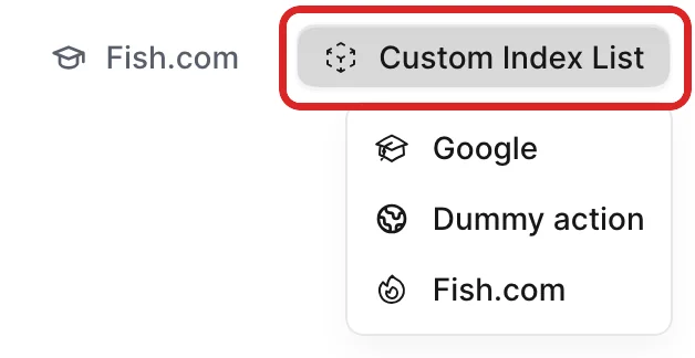
Within the block the permitted elements are link_to, action, and divider. Unlike a directly declared action control, actions inside a list do respect the action's visible block.
The dropdown styles its own items, so style, color, and size have no effect on a nested link_to or action. icon, label, and a link's target, data, class, and forwarded HTML attributes all still apply.
WARNING
Button controls like back_button or edit_button are not allowed inside a list block — in development they raise an error.
-> divider
Renders a divider line between the items of a list dropdown.
-> default_controls
Re-adds the current area's default controls, so you can add controls before or after them without re-declaring them all.
self.show_controls = -> do
  link_to "View on site", post_path(record), target: :_blank
  default_controls
end
Control options
Not all controls take all options — each control's entry above lists the ones it accepts. Control-specific options (target, data, class, arguments, include, exclude) are documented on their control.
-> label
The text displayed on the button. Pass an empty string ("") to render an icon-only button.
- Type: String
- Default: varies per control (see each control's entry)
-> title
The tooltip for that control.
- Type: String
- Default:
nil
-> style
Sets the style attribute for the Avo::ButtonComponent.
- Type: Symbol
- Default:
:text(:outlineforactions_listandlist) - Values:
:primary,:outline,:text,:icon(icon-only, used in row controls)
-> color
Sets the color attribute for the Avo::ButtonComponent.
- Type: Symbol
- Default:
:gray - Values: any color of Tailwind's default color palette
-> icon
The icon displayed on the button.
- Type: String
- Default:
nil - Values: any Heroicon, with the style included —
heroicons/outline/academic-caporheroicons/solid/adjustments
-> size
Sets the size attribute for the Avo::ButtonComponent.
- Type: Symbol
- Default:
:md - Values:
:sm,:md,:lg
-> confirmation_message
The message shown in the confirmation dialog before running delete_button or detach_button.
- Type: String
- Default:
nil("Are you sure?" for the default row controls)